A little realign
Things are looking a bit different around here. It’s not a redesign so much as a realign. I’ve been tinkering for a few months, and finally got to the point where I’m happy to push it live (even though there’s more I could do.)
There were a few particular goals for this redesign:
Rewrite the CSS
I lived in fear that someone might look closely at my CSS. My last redesign came about when responsive web design was still young, and I was incredibly foolish. I linked to three different stylesheets in my header, one for 320px and up, one for 768px and up, and one for 1024px and up. There were some “minor” breakpoints in these stylesheets, but yes, I was using fairly device-based breakpoints, and that was three HTTP requests in the head. Certainly not ideal.
The previous version was also a peculiar Sass/plain CSS hybrid as I’d started learning Sass a few months into the redesign. As Sass is so easy to integrate into ordinary CSS, it wasn’t too problematic, but I knew I could lessen repetition and make the structure of my CSS much easier to maintain if I moved it all into a consistent format.
Now I’ve rewritten all the CSS from scratch using Sass, and added in a few new techniques, such as flexbox, for some of the form elements. If you’re interested in how badly I write Sass, I’ve uploaded those files (in the spirit of Dan Eden’s max CSS) into a /sass folder and you can find the file references in the main file, style.scss.
Reboot the typography
I love Avenir, I really do, but I was increasingly aware that it can be hard work to read as body text. After falling in love with Brandon Text, I decided it was a nice evolution from Avenir, keeping the geometric shapes but in a softer, more legible, way.
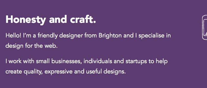
Avenir as display and body text on the old version of my site
I recently read Tim Brown’s fantastic Combining Typefaces book and felt encouraged to be braver with my typefaces choices. I didn’t want to just keep using different weights of the same family as I had before. After some deliberation and advice, I settled on Arek for headings, to add a bit of quirky personality to my site. This is the first time I’ve used Fontdeck properly, and I’m really pleased with the quality of the font and the speedy rendering.
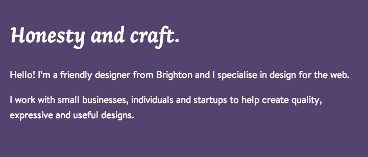
Arek for the display, and Brandon Text for the body on the new realign
I’m both self-hosting and using external JavaScript to pull in fonts for my site. Brandon Text is self-hosted whereas Arek is hosted on Fontdeck. I can’t quite make up my mind whether I prefer to suffer slow loading times on my self-hosted fonts, or the risk of my site depending on another site for the fonts to load with a font delivery service.
Simplify
The illustrations had to go. I’m always trying to tame my temptation to over-decorate, and while the illustrations in the previous version were a nice responsive bonus for large screens, a cleaner design is less distracting.
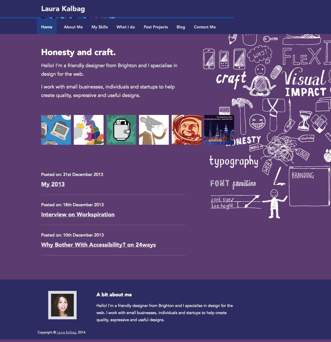
Previous homepage layout, with portfolio images, blog posts and a messy illustration
For a long time, my homepage was my most hated page. And the most visited. It just felt like everything had been thrown on, it was unstructured and untidy. Given that the second most popular area of my site is the Past Projects, I decided to include twelve (nicely divisible for smaller screen sizes) images from my past projects and a brief introduction.
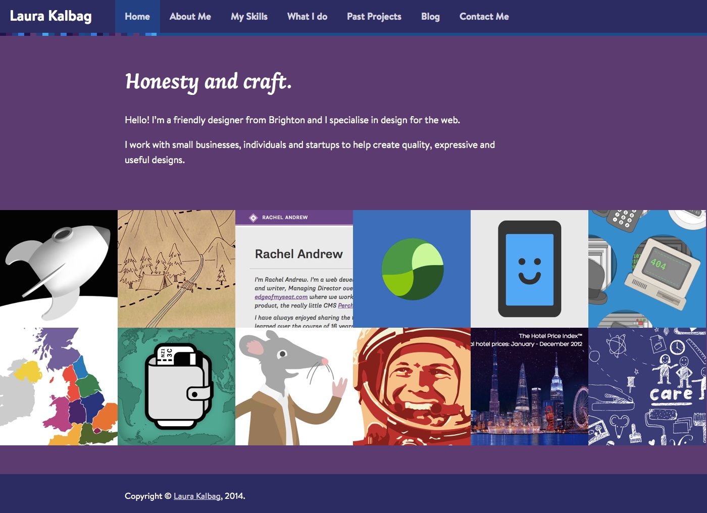
New version of the homepage, with just an introduction and larger portfolio images
WordPress, by default, gives you so many options for meta information on archive pages. I previously listed the amount of comments, categories and tags on each post on the blog archive. On the projects archive I listed the dates and type of project. I realised these were unnecessary chunks of information that were easy enough to find on the single post or project pages. Just because I could add everything to each template, it didn’t mean I should. Less repetitive content means the pages are now cleaner, easier to read, and nowhere near as long as before.
Previous blog, with lots of information about each post
New blog post layout with no unnecessary meta information
New projects with Dribbble shots
I’ve been terrible at keeping my portfolio up to date in the last year. I’ve still got five projects that are halfway to being documented, but I’ve added four recent projects with some more in-depth explanations of the process. I want to keep adding more useful explanations to each project, making it more of a case study, so they’ll inevitably take a little longer.

four new case studies: Indie Phone, Freelancing map illustration, Rachel Andrew’s site and the Turbine logo
After hearing Andy Clarke chat with Dan Cederholm on Unfinished Business a few months ago, I shamelessly borrowed Andy’s great idea to include Dribbble shots from a project in my portfolio. I found a handy plugin to grab my Dribbble shots as they’re posted and add them into WordPress, so I can now easily connect my Dribbble shots to the relevant post and include a little gallery at the end of each project case study.
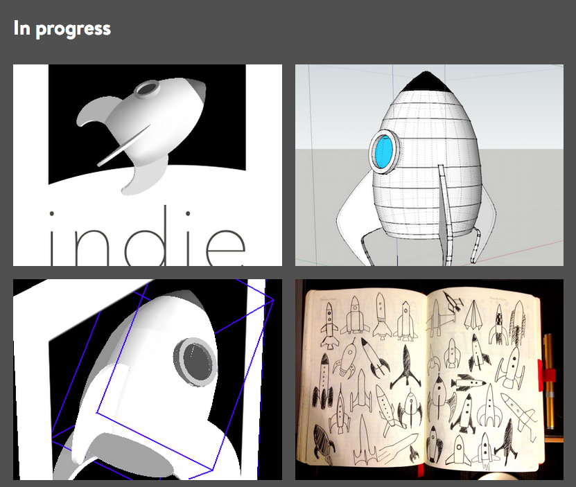
progress shots from the Indie Phone project
There’s probably more to do…
As ever, there’s always more testing to be done. I don’t expect this site to be perfect, but I thought it was about time I hurried up and pushed it live. If you spot anything wonky, please let me know in the comments, on Twitter or send me an email. I’ll be very grateful!
Hey Laura!
I have frequently visited your site in the past year for reference and inspiration. Even before the new “realign” I appreciated your bold choice of color and great copy (especially the “about” page).
I just so happened to be making a few adjustments to my own site late last night and turned to your site again for inspiration when I noticed the changes on your homepage, and I must say — brilliant little improvements. The fonts look great, and the new layout on the homepage is indeed simpler and quite inviting I think.
It reminds me also that as designers, and as people that grown and change, our websites don’t have to be something that we re-design every year-or-so — they can be continuously changed and adapted as we grow and learn, and our design tastes change as well.
It makes me think of [Frank Lloyd Wright’s Home and Studio](https://www.google.cl/search?q=inside+frank+lloyd+wright%27s+home+and+studio&client=firefox-a&hs=PHG&rls=org.mozilla:en-US:official&channel=sb&source=lnms&tbm=isch&sa=X&ei=SK1jU5SPDPO0sASJkoHoBw&ved=0CAgQ_AUoAQ&biw=1360&bih=631" rel=“nofollow) in Hyde Park, Illinois (US). When you walk through it much of it seems like a hodgepodge of different styles and periods, and it was because it was his home, and he was constantly experimenting on it with new ideas that he would then take out into the wild and use on his paid projects. Shouldn’t our own websites be that too? Besides a portfolio or résumé or whatever, what better place for experimentation and growth? If you got feedback today that was overwhelming negative about the changes you made (doubt you will), well you’d just change them again. No big deal, right? What a great way to learn?!
Anyway, cheers to the realign, and keep killing it!