Picking Fonts
This little post is an extension of my post on Web Fonts.
Of late, some of the snobbier designers are whining that more fonts available will mean the web will get covered in horrible mis-use of fonts, unreadable body text and general ugliness.
I don’t think this is totally fair, but I’m sure some people might get confused by the variety of fonts that are around, so I thought I’d share a few things I try to keep in mind when choosing fonts:
Use appropriate fonts
Easily said, I know, but some fonts are clearly more suitable for particular designs than others. For example, you wouldn’t use a font that looks like it’s dripping blood on a corporate site, and you’d not use a handwriting-style font on a site about computer programming.

If you’re aiming for clean and modern, go sans-serif. If you’re looking for a slightly more traditional feel, go serif.
Don’t use more than two fonts
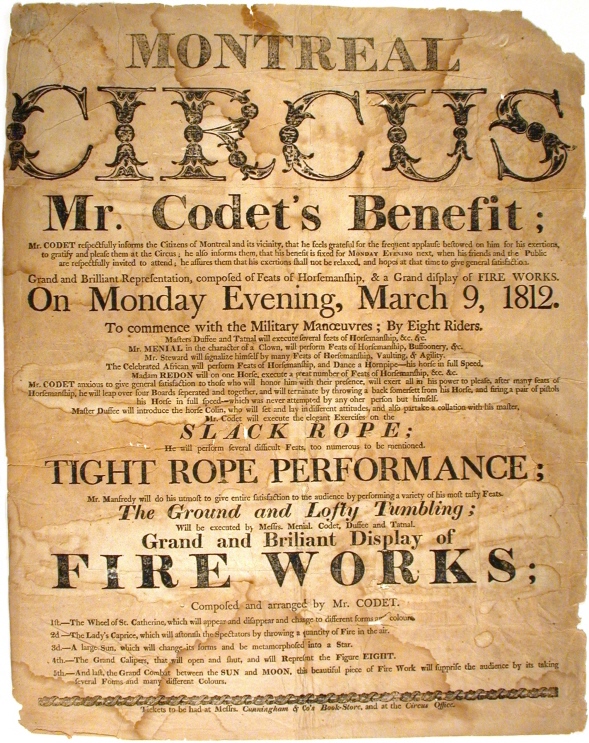
With all these cool fonts around, it’s easy to go over-the-top and try out loads at once. Unless you’re going for a Victorian poster style, I’d steer clear of the multi-font look.

It’s difficult to find two fonts that match each other well. You want to look for as similar shapes as possible, round fonts with other circle-based fonts, condensed fonts with other tall, thin fonts.

If you’re really struggling to combine two, just use a different weight or style for the heading, like bold or all uppercase.

Mark Boulton covers these kinds of combinations in his fantastic book, A Practical Guide to Designing For The Web.
Keep it in the family
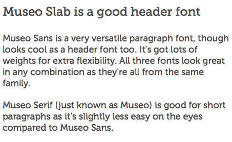
The easiest way to find two fonts that suit each other is to take two from the same family. These are always designed around the same shapes so you know they’ll look good next to each other. This is particularly useful if you want to mix serif and sans-serif fonts. For example, the Museo family. Museo Sans, Museo Serif and Museo Slab all look great used in any combination.

Use simple fonts for body text
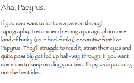
Whatever you do, leave the fancy fonts for the headings. With body text (paragraph text,) you’re aiming for readability above all else. Using any kind of fancy, looping, scrawly, drippy, firey font here will make it hard to read and really distract the reader.

Use lovely long font stacks
Bear in mind that, whatever fancy web font method you use, there will always be a user that can’t see that font. It might be because their browser doesn’t have javascript turned on, or doesn’t support @font-face or doesn’t have the system font you specified. Solve this problem by using as many similar fonts as possible in your font stack.
For example, I want to use Museo Sans as my body font on this page. My code would look like:
body { font-family: "Museo Sans", "Perspective Sans", Helvetica, Arial, sans-serif; }
- Typekit will provide Museo Sans for me, so I’ll put that first in my font stack.
- In case the user doesn’t have javascript enabled (or uses Opera!) I’ll specify an @font-face font I found on Font Squirrel, Perspective Sans.
- For the rare case that don’t support Typekit or @font-face, I’ll specify the system font Helvetica.
- Just in case a user doesn’t even have Helvetica, I’ll also specify the wildly popular system font, Arial.
- And for the user who for some reason has only weird fonts I’ve never heard of on their computer, I’ll specify sans-serif, so at least I know that they’re not being delivered a serif font when I really fancied sans.
Not much effort, maximum kindness to the user.
Keep the poor Windows users in mind
Whichever fonts you choose, you want to make sure it looks good in as many browsers as possible. For us lucky mac users, the fonts tend to normally look smooth and light and lovely. Unfortunately many Windows users aren’t so lucky. Craggy, pixelly and oddly squashed-looking fonts are very common.

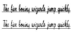
Typodermic’s Bouffant font in Mac’s Safari (top) and Windows’ Internet Explorer 6 (bottom)
Many Windows people aren’t as fussy as me, or just don’t notice, but it’s really worth checking that what the Windows’ users see is actually legible.
This quick little guide is just the beginning of all the things I try to consider when I’m choosing fonts to use on the web. A lot of it feels automatic, but when I really think about it, there’s all sorts of rules and theory I’m trying to apply to my choices. And that’s still not saying I always get it right. To a degree, it is still a subjective choice.
OK, rant over :-)