Responsive Day Out
A month ago I spoke at Responsive Day Out, an “affordable, enjoyable gathering of UK designers and developers sharing their workflow strategies, techniques, and experiences with responsive web design.” As I said to Jeremy Keith when he first asked me if I wanted to do it, this would be a day I couldn’t possibly miss, regardless of speaking. It very much lived up to my expectations.
After a whole month of mulling over the talks in my head, and chatting to other people who were there or who have listened to the talks since (you can listen to them here, or watch them on BeSquare), I’ve joined a lot of dots in my head. I had intended to publish this writeup just a few days after the event, but burnout and a whole lot of client work got on top of me.
Even though it’s a month later, I still wanted to share all of these great things I learned on that day. This writeup has now become a writeup-reflection. Do I still feel excited by these things a month later? How did these talks affect my work over the next month?
The hugeness that is Responsive Web Design
Elliot Jay Stocks described Responsive Web Design as being about “making your site accessible and adaptable to any device, regardless of the design.” Bruce Lawson described it as “make it work everywhere or else you’re a walrus.”
For a seemingly niche subject for a day-long conference, the amount covered in this day was huge. As Mark Boulton put it in the closing talk, responsive web design is, in a way, bigger than web standards. It disrupts far more industries than our own. The subtleties in the markup that we write is only visible to us as developers, but responsive web design has an effect on any user of the web, and any industry that has a presence on the web.
Despite having such a huge impact on modern web design, there wasn’t anyone really preaching that responsive web design is the “one true solution”. One of the first points David Bushell made was that if a site that isn’t optimised for small viewports and isn’t too hard to browse on mobile, then it’s worth considering whether an alternative is really worthwhile.
All the devices
Since the dawn of Responsive Design (and before that, really) we seemed to focus on making our sites work on particular mobile devices. Namely the iPhone. It made life easier as we just had to design for a few more specific widths of websites.
Many of the speakers at Responsive Day Out spoke about how we need to break away from designing for specific devices, as you’ll never be able to cater for every user, and there is no average, normal or most common viewport width or capabilities. In his talk about future-friendly browser support, Tom Maslen posited that there are far too many edge cases (almost every device is an edge case in some way) to take this approach, and that you have no idea what’s going to come out next week or next year.
“You’re never going to win, you’re playing the wrong game…” David Bushell on designing for devices
“Device detection isn’t futureproof. Avoid.” Anna Debenham on designing for devices
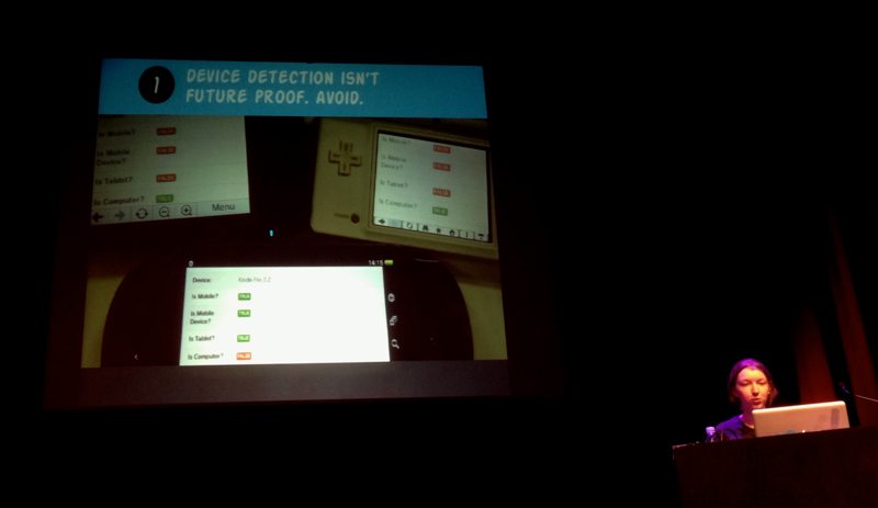
Anna Debenham—Device detection isn’t future proof. Avoid.
As Tom Maslen pointed out, we’re foolish focusing on devices. Before responsive design, did we ever talk about whether a website worked on a particular Dell PC or a MacBook? We didn’t, we thought in terms of browsers and whether our sites worked in Internet Explorer 8 or the most recent version of Firefox. This makes it much easier to test and gives us a much narrower set of requirements that our sites need to fulfil.
David Bushell explained how screen size doesn’t equate to viewport size, as many desktop users, especially those with very large displays, will use browser windows much narrower than their screen. Something that I also touched on in my talk was that you can’t judge what device is being used, or what user is doing based on the size of their viewport. A narrower viewport does not necessarily guarantee a mobile device, or low bandwidth or that the user is “on the go”. A narrower viewport could just mean that the user has stuck the browser window to one side of their enormous display on a high-end Mac, using broadband while at work in their office.
Breakpoints and tweakpoints
Many of the speakers discussed breakpoints, but not obsessing over them as the defining feature of Responsive Web Design. While most of us have been guilty of basing breakpoints on particular (Apple!) devices, the focus was on moving away from device-based breakpoints.
Mark Boulton suggested that breakpoints should be based on changing user experiences based on the features and capabilities of the browser; using “macro breakpoints” when something big happens, such as a layout change, and mostly basing your CSS around “micro breakpoints”, on the little tweaking details that add up to 80% of your styles. These are very much along the same lines as Jeremy Keith’s “tweakpoints”.
In my talk I shared my ideas of basing breakpoints around the optimal display of the content, as every content element has an ideal maximum width and and ideal minimum width. Using the content in this way ensures the best browsing experience, as well as using constraints derived from the one thing that won’t change in the future.
Bruce Lawson also touched on making assumptions about types of user interaction based on viewport size. Bruce gave the example of browsing a site on a TV. Whilst the TV screen is very large, the distance at which you sit from it makes the interaction more akin to using a mobile device, they occupy the same space in your field of vision.
Not just screens, but inputs
Anna Debenham’s talk on consoles showed us the wide range of web browsing experiences on gaming devices, and how the inputs and interactions on these devices have a huge impact on the browsing experience. Combinations of touch screen and voice input, stylus wielding, button hitting, pointer waving and joystick nudging can make the web a challenging experience on consoles, however Anna emphasised that designing specifically for these devices isn’t the way forward. These devices are rapidly improving their support for web standards, so building a site with web standards, multiple contexts and accessibility in mind will inevitably result in a site that’s a joy to use on a console.
“Don’t design for consoles, design for everything and nothing.” Jeremy Keith summing up in the panel session after Anna’s talk
Designing for features and capabilities
Mark Boulton, Andy Hume and Tom Maslen all spoke about designing for features and capabilities instead of devices. This is tied in with the idea of progressive enhancement, which many of us have been using as a web development mantra for years. Tom Maslen named his talk after the technique of judging browsers which “cut the mustard.”
Cutting the mustard
Tom Maslen and Andy Hume both work on large news sites (bbc.co.uk, guardian.co.uk) and so shared their experiences of practically applying responsive design to huge content-heavy sites. Their technique of “cutting the mustard” is to define a list of browsers deemed to be ‘modern’, with a certain set of features and capabilities, and then delivering a progressively enhanced experience to those browsers only.
This technique relies on building a simple core experience where the content is accessible from any device. Andy suggested there are three stages of the page load, where only one is vital:
- “content”: HTML and CSS
- “enhancement”: javascript which enhances the experience with rich/interactive media
- “leftovers”: analytics, ads, and anything else which is least important to the users but useful to include on the page
Tom pointed out that using this technique would mean no time wasted on polyfilling, or other ways of trying to make the older/less capable browsers support the same enhancements. As the browsers that cut the mustard all support modern standards, you can be assured of a good level of support for CSS and other modern technologies.
This approach is far easier to manage than the BBC’s previous strategy of supporting a specific table of browsers, using graceful degradation to give a similar experience to all users. This was all easy enough when all browsers were free, uncomplicated and easy to test; where you could test most browsers on either a PC or Mac, but now you need to invest in an enormous array of devices to test on every browser.
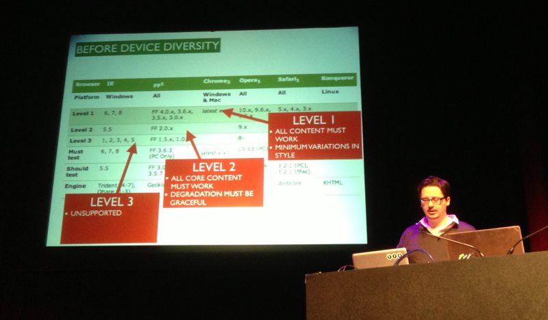
Tom Maslen demonstrating the BBC’s previous strategy of supporting a specific table of browsers
More markup and code
“The web and web standards have always been responsive”-Bruce Lawson on how the web is inherently flexible.
Bruce Lawson started his talk saying that we constrained ourselves on the web. Mark Boulton later pointed out that we didn’t really constrain ourselves, we’ve been using the web for everything and anything when it was really just designed for memos. The web wasn’t designed to be inherently flexible, it just happened that way.
Fluid design
However, Bruce was really highlighting the fact that we could have been developing sites based on fluid layouts for years, it’s just that most of us have been falsely constraining ourselves with fixed-width layouts in order to give us more control. Throughout the day, Jeremy Keith relished in telling us how he’d always worked in this way and how it made the move to responsive layouts significantly easier.
Andy Hume spoke of an ideal future where every component of a site would be standalone, as a modular part of a greater system. Building our sites in this way would mean we didn’t even need to rely on media queries. If we built our components to suit any width, embracing fluidity, they would fit any device without forcing particular responsive behaviour.
All the CSS possibilities
Bruce Lawson introduced us to a huge amount of existing and up-and-coming standards that we’ll be able to use to make responsive design much easier.
Viewport meta and @viewport
Bruce explained how the viewport meta tag meta name="viewport" content="width=device-width" is a bit of a blunt instrument, and how it’s really mixing presentation into our structure as it’s telling pages how to display from within the HTML and not the CSS.
Bruce showed us a potential solution using an @viewport rule in your CSS which could replace the viewport meta tag and allow for more sophisticated combinations of viewport and media query rules.
Some next level CSS
Under the cheeky name of “CSS Level 4”, Bruce walked us through some proposed additional media queries:
(script)which can be used to provide fallbacks or enhancements based on whether the browser supports JavaScript- supported inputs and interactions such as
(touch),(hover),(remote)and(keyboard)which can be used to optimise the user experience based on the capabilities of their device
These could be used to replace the functionality of something like Modernizr, where JavaScript is used to detect browser capabilities.
Flexbox