Responsive Web Design
I had ordered Responsive Web Design by Ethan Marcotte as soon as it came out, but being at Ampersand conference, and hearing so many people recommend it, really spurred me to take a few hours out to get on and read it.
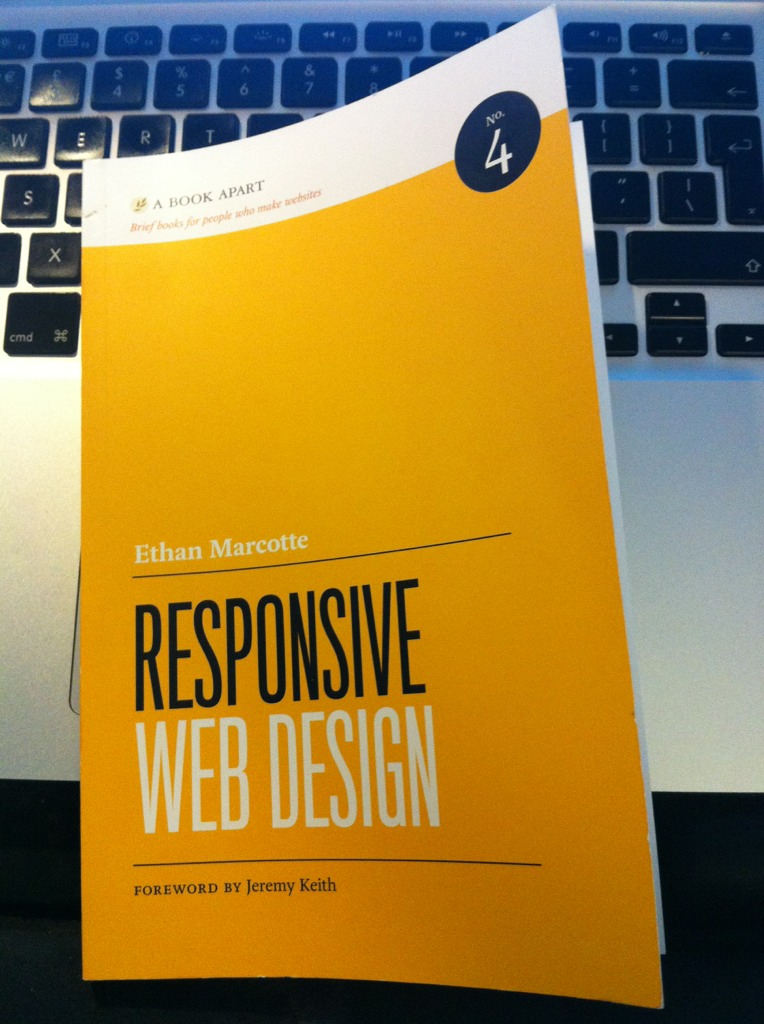
My copy of Responsive Web Design, already featuring a 'much used' cover curl…
Responsive web design is a term summarising design that has a flexibility allowing it to be optimised for different browsing experiences. This might be low levels of detail for mobile devices, big readable layouts for massive projector screens or dumbed-down CSS for old-fashioned browsers. I’m so sure that Responsive Web Design will be our bible for flexible web design for years to come.
The reason why I say ‘for years to come‘ is that Responsive Web Design doesn’t just furnish you with markup examples but actual reasons to do it. Much like its predecessor, HTML5 For Web Designers by Jeremy Keith, Ethan Marcotte walks you through how to think responsively, integrating flexibility into the design and development processes, and what might trip you up on the way.
The book is split into five easily-digested chapters:
- Our Responsive Web
- The Flexible Grid
- Flexible Images
- Media Queries
- Becoming Responsive
These make for great reading if you can only fit one in at a time, but I reckon you could get the whole book read in front of a computer, trying examples as you go, in an afternoon.
I can tell you how useful this book is from how it’s helped me on a recent site design. I have always struggled with creating fluid CSS layouts using percentages. The maths has always boggled my mind and I tend to give it a go then give up when everything falls to bits as soon as I resize my browser window. The thorough explanation of using the magical formula, target ÷ context = result, had me working out percentage-based margins and paddings with very little effort. Now my designs can be more than just ‘mobile version’ and ‘desktop version’!
Part of what makes this book so valuable is the Bot Blog example site walkthrough. Being able to see how you can apply an original fixed-width design to a fluid-width site really helped me understand the restraints and opportunities created by working responsively. The breakdown of media queries is incredibly handy, especially as they’re explained first from the position of starting with an average-width screen design, adapting down to small screens and up to larger screens using *max-width *rules, and then from the position of ‘mobile first,’ adding styles for gradually larger screens using *min-width *rules.
My favourite part of the book was where ‘Mobile First’ was introduced. This is the concept of developing first for a mobile browsing experience, then building upon that experience for bigger, more-advanced browsers. It’s pretty much a mobile-focused version of the progressive enhancement approach. It’s a great alternative to starting big and adjusting your CSS for small browsers as it means you’re not delivering huge long stylesheet files to phones that may have a slow or limited connection. Quite a few developers on the more mobile-side of the web industry have been talking about ‘mobile first’ for years, but it’s great to see it really pulled into mainstream consideration.
Ethan Marcotte writes in a style that is casual but smart and funny in sweet, geeky way. His writing makes you feel like you’re learning from the easy-going class assistant rather than the boring teacher. It’s definitely made me opt to buy the two titles in between HTML5 For Web Designers and Responsive Web Design, CSS3 For Web Designers and The Elements Of Content Strategy, as both books I’ve read so far are so informative and inspiring. There’s also Designing for Emotion and Mobile First to look forward to in the autumn!
4 comments
-
martcol
Thanks for this. It’s a title now on my most wanted list. I do think that building for the web is getting more complicated more quickly. Hopefully this will help stop me feeling I’m falling too far behind. d(>_<)b -
Andy
I found the book really useful, but my biggest issue was that the entire book was written desktop first, and then the final chapter introduces mobile first, which means reversing not only all the logic, but also how you think and build in the first place. If mobile first is the way to go –; and I agree that it is, why didn’t Ethan introduce that from the start ?-
Laura
I’m not sure if I’m right, but I’d think it was probably because it’s more useful to the majority of readers to introduce something that isn’t such a huge leap from their current process first. The non-mobile-first approach could be easily used on an existing site to enhance it, but you really need to be starting a project afresh to begin with mobile first. -
Charlie
The book is a good, lightweight read. My only criticism of the book is that Ethan has already published most of chapters 1-4 via sites like a list apart, so there was nothing in there that isn’t freely available. That said its still a good read and his suggestions of how to incorporate responsive design into the design workflow with developers was useful.
-