A realign for 2015
Almost a year after last year’s realign, I’ve made some more tweaks to my site. There were a few reasons behind it:
- I’m not freelance anymore, so I don’t need the focus on my portfolio
- As I’m now working with Ind.ie, I needed to update my about page
- The navigation needed some accessibility work
- The colours were beginning to grate on me
Less portfolio, more…
My blog has been fairly quiet, but actually that’s because I’ve been writing a lot elsewhere. I write a weekly roundup on the Ind.ie site every week, and a regular column on A List Apart. I want to keep up with linking back to this new content, and keep writing more blog posts specifically on this site. As the portfolio isn’t needed so much, as I’m not looking for clients, it doesn’t need as much focus, so I’ve moved latest posts to a more prominent position on the homepage. However, I do want to keep up with the project case studies. They’re fun to share, and help me remember what I’ve done. I’ve got a big backlog going back at least a year, but I will get those projects up!
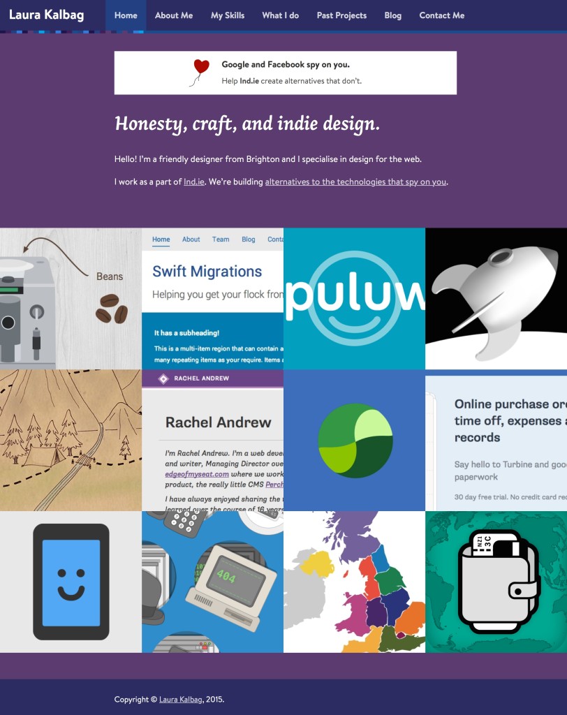
Old homepage with big portfolio, loud colours, and the ill-fitting Ind.ie banner (now the Ind.ie logo is more subtly in the header)
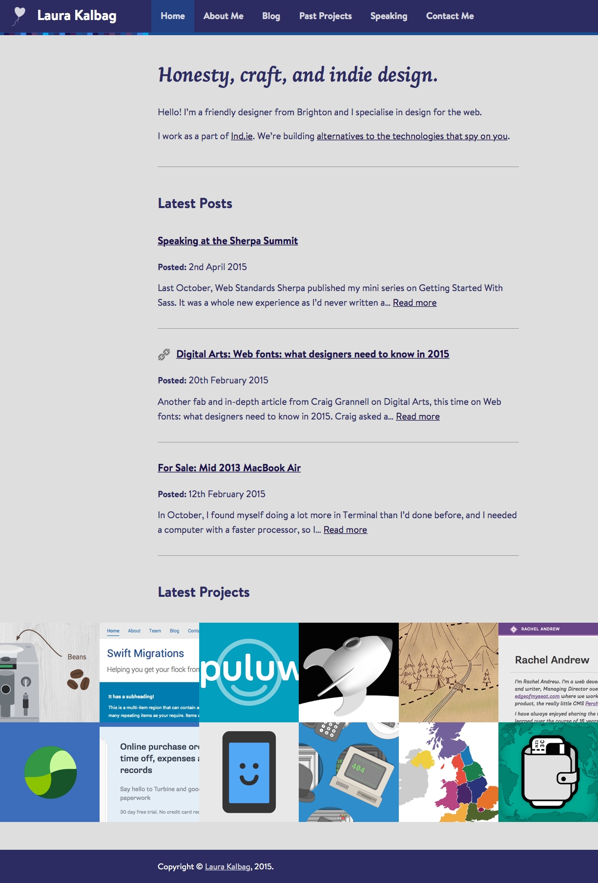
New homepage with blog posts, smaller portfolio and different colour mix
Less about me…
The site previously had loads of “about” content. There was a ordinary about page, then my skills, who I work with, what I do, and separate pages detailing my main areas of work. These are all now streamlined and redirected into a properly up-to-date about page.
Navigation accessibility
Recently I’ve been getting my head around WAI-ARIA. It’s a very valuable way to help make more modern interactive elements of your site accessible to assistive devices. This was massively helped by the wonder Heydon Pickering, who sent me this tweet:
[@laurakalbag](https://twitter.com/laurakalbag) Hey Laura. Know you’re big on [#a11y](https://twitter.com/hashtag/a11y?src=hash), so thought you may want to try [http://t.co/iiYoaLRYbp](http://t.co/iiYoaLRYbp) to fix your site’s dropdown.
— Hayden StandardAware (@heydonworks) November 14, 2014
I’m just ashamed that it took me so long to get around to it. Now, thanks to Heydon’s fantastic rundown of Practical Aria Examples, I’m using aria-controls, aria-hidden, and aria-expanded to great effect.
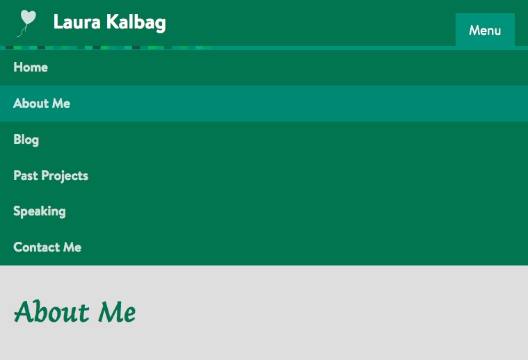
The dropdown navigation menu which shows on narrower viewports is now more accessible. You can view the page source to see more.
The colours
I love my brightly coloured site, and the custom colours for different pages, posts and projects. I’ve used Advanced Custom Fields to set up colour pickers for the WordPress page and post editors, so I just have to choose a colour every time I publish. The colours are pulled in via PHP, on top of my general styles, into the CSS in the <head> of each page. My pickers look something like this:
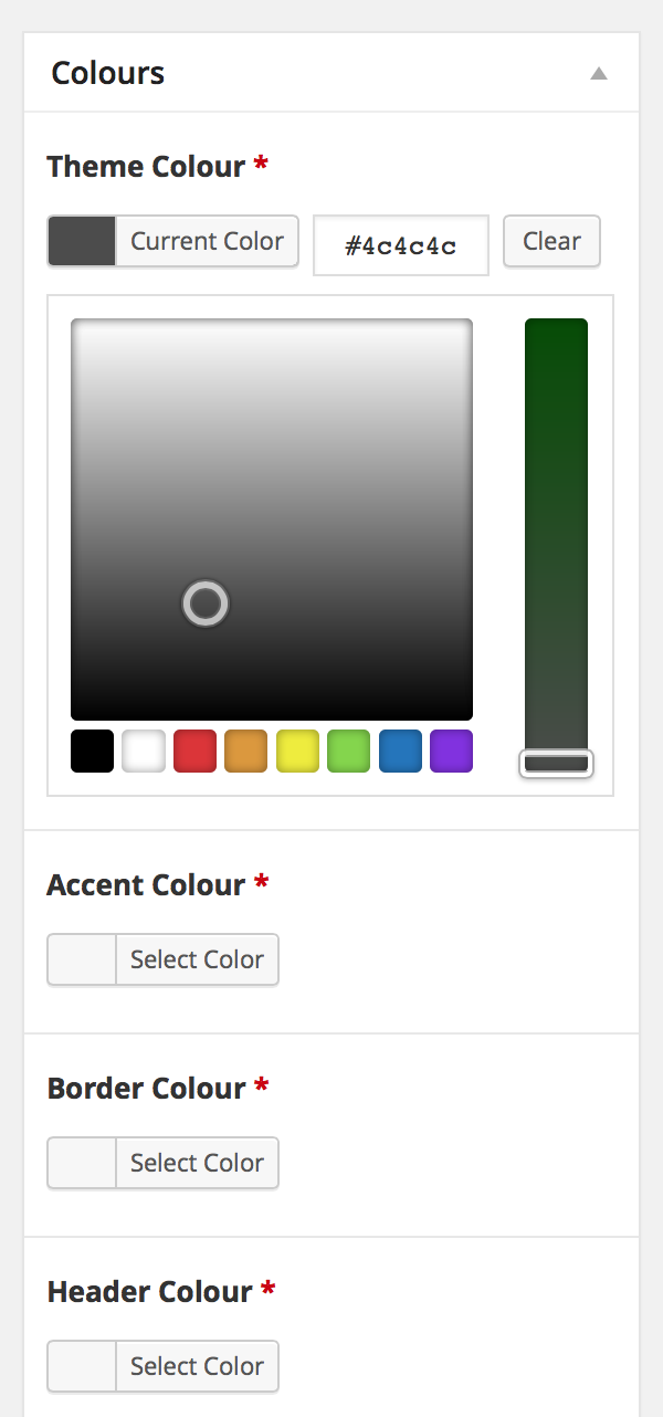
The colour picker in the WordPress post editor
In the previous design of the site, I used brightly coloured backgrounds with white text. However, this was getting a little bit dicey with readability. While I made sure the colour combinations had a contrast that was technically accessible, I’d often go back to a post a few days later and shudder at my appalling colour choices. I needed to ease off the colour and go a little bit cleaner. However, I had picked a colour palette for every page, post and project on my site ever when I’d redesigned in 2012. It’d be a shame to waste all that effort. I decided to just switch some of the colour palette choices around, so the background was a simpler easy-on-the-eyes grey, and the text would take on the colour. Suddenly the site felt a lot less oppressive!
I learned a lesson in semantic naming that day. Unfortunately, if you rename a field in Advanced Custom Fields, it wipes out the entries in the database for that field, so I’m stuck with my original palette names such as “header colour” for the colour of the text. Hopefully the colours match up fairly well, as the contrast hasn’t changed much, but please let me know if you find a page that’s hard to read.
Other tweaks
There are lots of other little fixes and changes I’ve made after having them on my list for ages. Fixing block quote styles, footer layout on certain viewport widths, mismatch of font sizes before and after web font loading, dodgy search box layout and ensuring I’m not loading the web font loader from Google anymore.
SSL hoorah!
And the final thing is that this site now works at https://laurakalbag.wpengine.com. That’s thanks to WP Engine for enabling SSL as an option on their personal accounts, making it as easy as me pressing a button and paying a little bit of money.
Hopefully this site is now a little easier to read, and way more up-to-date. I like to think it’s a little bit more grown-up. Any further suggestions always gratefully received!