Accessibility By Design
On Thursday morning I gave a talk online for Inclusive Design 24, a free 24-hour event celebrating Global Accessibility Awareness Day (#GAAD.) I wanted to share my talk in a more readable way, so here it is:
In the last two years, I’ve given eleven accessibility-related talks, almost entirely on an introductory level. I want to go into a group of people who work with the web, and convince them to make their sites more accessible, no matter what their role or position. If they’ve not heard of accessibility before, then it’s not usually a hard sell. It’s hopeful, positive and appeals to peoples’ good sides. But if they have heard of accessibility it’s a much harder sell.
As web professionals, we come up with so many reasons to avoid accessibility. It’s not often one solid reason but a hazy combination of the following:
- we don’t understand who we’re trying to help
- we’re not sure what to do
- it’s hard, and there’s too much to think about
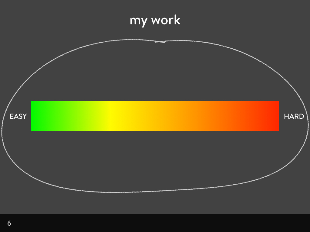
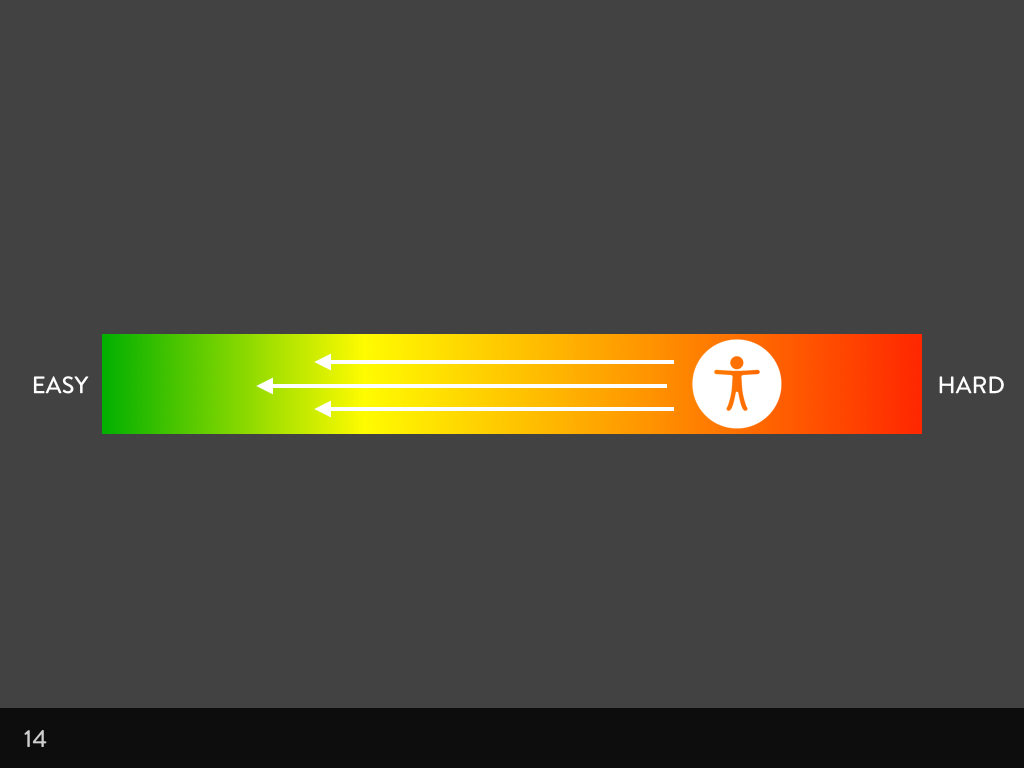
I’ve addressed these reasons before, so I won’t cover them here, but it’s important for us to understand why we think this way. We think along a decision-making scale that goes from easy things to impossible things. The reasons I mentioned before aren’t really excuses, but are mapped to different locations on the scale based on how a person perceives the difficulty of accessibility in relation to their job and its associated tasks.
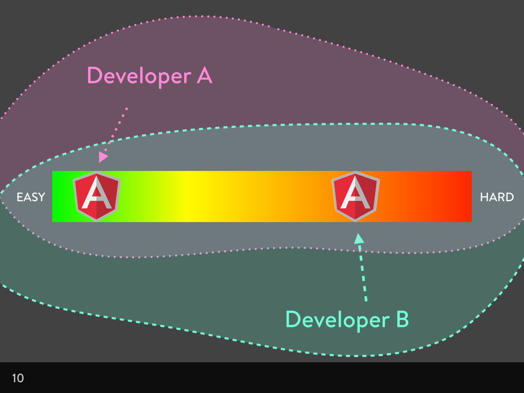
One developer might see learning Angular as a challenge, but another developer might already know Angular and so see it as an easy decision. One content strategist might have worked with lots of video, but another might be more experienced working with text. One designer might create prototypes in HTML and CSS, but another might work exclusively in Photoshop.
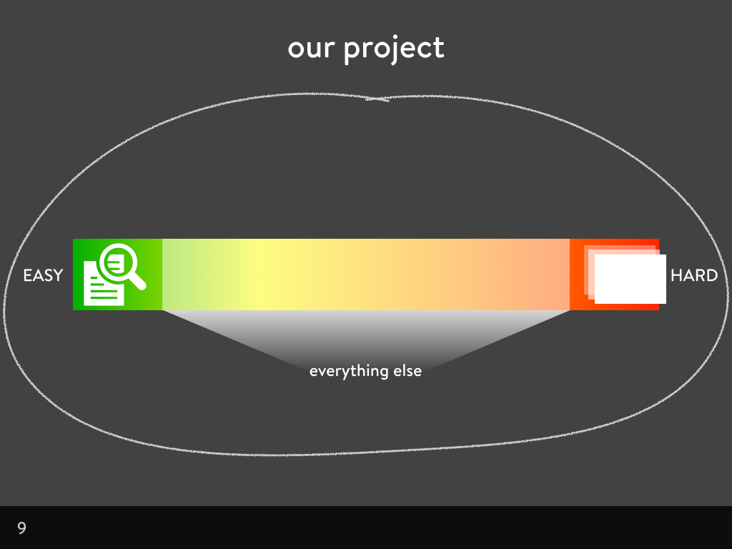
When we’re working on a project, we have to balance all the factors and features on our difficulty scale. There are easy wins we can incorporate into projects without thinking about it: this could be the decision to use text to communicate on our sites. You might think: “Using text on a web page? It goes without saying!” But somebody has to write that text, so it’s not really a given. Instead it’s an easy win.
There are impossibilities that we’ll (probably) never try on our projects: this could be the decision to make our site scroll on the Z axis, out of the screen, into some kind of cool 3D hologram between the viewer and their screen. It’d be incredibly difficult to achieve, and probably completely irrelevant to our project, so we’re never going to do it.
And all other decisions are somewhere between text on a web page and Z axis hologram scrolling. We’ll decide an approach or a feature’s worth based on its position on this scale, and based on how many other things are on the scale. Do we have a lot of easy wins on the scale? Well, maybe we can do one difficult thing. Do we have a lot of moderately tricky tasks on the scale? Then maybe one of them has to go, based on our budget or how much time we have.
As people trying to promote accessibility, we need to help pull accessibility up from the “difficult” end of the scale, towards the “easy” end of the scale. How we approach making accessibility easier depends on who we’re trying to encourage. Give a copy writer an alt attribute and they’ll have a more accessible image. Teach a copy writer how write alt attributes, and they’ll have accessible images for a lifetime.
I’ve mostly found developers and content creators fairly easy to convince about accessibility. The most trouble I seem to get is from designers. Which is strange because I’m a designer. So why are designers a sticking point? When our content is fabulous, our markup and code is well-structured and thoughtful, even our interactive behaviour is well planned, but the visual side lets us down. Aesthetics are often even the enemy of accessibility, how can we change that?
Differences between design, decoration and aesthetics
What does a designer do? It’s probably one of the most contentious job titles in the web world. “Designer” tends to be applied to people who work on the visual side. A designer might work on UX (user experience), or experience design, which is usually focused on what you can’t see as much as what you can see. Sometimes a designer is described as a “visual designer” to be extra clear. It’s these kinds of designers I’m going to discuss now. I do this kind of design. I also do other types of design at the same time. But when I’m working in this area of design, I call it “aesthetics.” It’s the stuff you can see.
Aesthetics isn’t just decoration. Decoration does very little. Decoration is the pretty stuff. If I had a pound for every time a client tried to employ me to add some decoration to their ugly site in the hope people would enjoy using it more, I’d have been a wealthy freelancer. But adding pretty bits to a site won’t make it a better experience. It’ll just make it an awful experience with bells on.
That’s why when I usually talk about design, I don’t just talk about the work created by the people with the job title of ‘designer’. Design is a problem-solving practice. Everybody on a team does it. Content strategists do it when they decide on a direction and approach for a product. Developers do it when they choose a framework or a coding language. Designers do it when they pick a layout. Every decision we make that has an impact on the final product is design.
What makes the difference between pretty effective and just pretty?
We use aesthetics to help convey the message in our content. That’s why the study of design is often called ‘Visual Communication.’ Communicating in a visual way aims to create media that:
- draws people into the content
- assists people in understanding content
- encourages people to respond to content
We achieve these goals by applying typography, colour, layout and form in a way that represents the meaning of the content, makes it easy to understand, and makes it easy to interact.
It’s easy to find design that fails in these goals. There’s a lot of stuff out there that looks good at a glance, and at drawing you in, but is impossible to use.
Anti-accessibility aesthetic trends
It’s a deliberately inflammatory title… I had a look at what the gallery websites reckon were the trends of the last four years. A disclaimer comes here as I don’t think anyone using these trends sets out to make their sites inaccessible. The examples following may well be incredibly accessible. These examples are just to show how these trends could compromise usability in favour of looking sexy and fashionable.
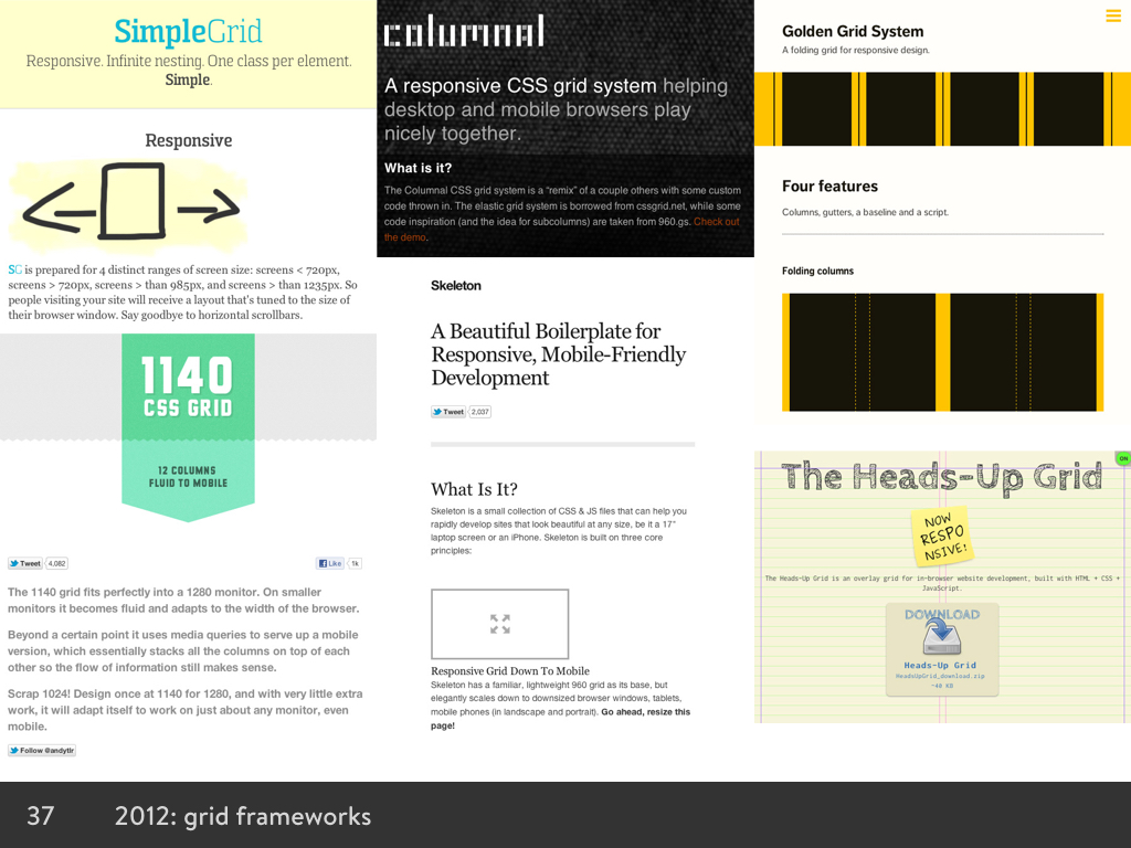
2012 was the year of the grid system
With responsive design becoming the rage, grid systems were abound in 2012. Frameworks popped up everywhere. Some frameworks, used responsibly, were great, making responsive layouts and prototyping very easy. However, most frameworks resulted in <div> and <span> soup when developers used them without any customisation or care for accessibility. There wasn’t a meaningful HTML element in sight…
2012 also heralded image carousels, back then still referred to as “sliders.” Designers could now cram extra content on to the page through the wonder of jQuery and other scripts. Unfortunately, the accessibility of the content, and the controls that helped you stop, advance, and rewind the content whizzing before your eyes, was not usually a priority.
2013 was the Year of Parallax
Scrolling with combined static and moving layers was the done thing. Rich content and storytelling made for compelling experiences, but also image-heavy pages that hijacked input conventions.
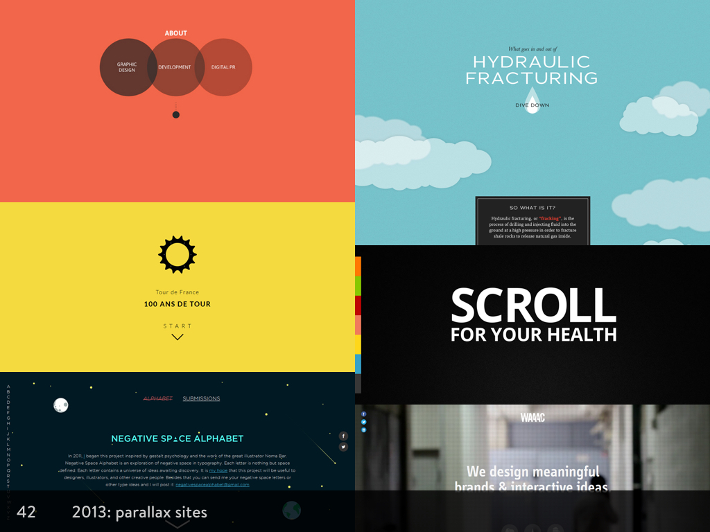
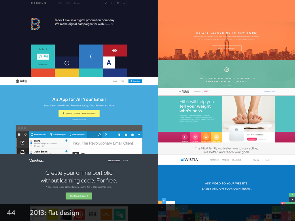
2013 was also the year flat design started becoming “a thing.” Textures and images lost favour as responsive design meant the elements on our pages needed to be flexible. ‘Flat Design’ with its solid blocks of colour could be created easily with CSS, load quickly, and expand and collapse to fit the viewport size with no loss of quality. This meant it was also the year designers learned how to spell new words as they endlessly argued the merits of flat design vs skeuomorphism.
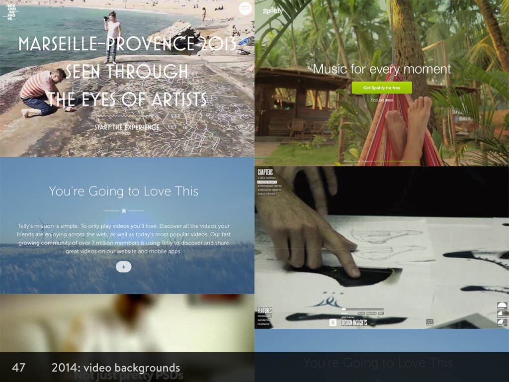
2014, Year of the Video Background
Video backgrounds became big in 2014. I’m not even sure why, as these videos probably only ran smoothly on the large desktop screens of the designers working at mega corporations with extra speedy fibre-optic internet connections. The rest of us have to put up with slow, choppy and pixelated videos making the layouts distracting, and making it hard to read the text overlaid on top.
Looking around at sites that predict and analyse the trends so far for 2015, there’s not much that’s new out there. A few sites have mentioned simplicity becoming a trend, and as long as that doesn’t just mean hiding stuff, that may be a good thing. It might mean that web design is finally growing up.
Constraints
You can see from the trends how much designers crave constraint. Fashion is a constraint. It’s much easier to come up with a design when you know what you have to do in order to be “cool” or “modern.” Charles Eames said that:
“Design depends largely on constraints.”
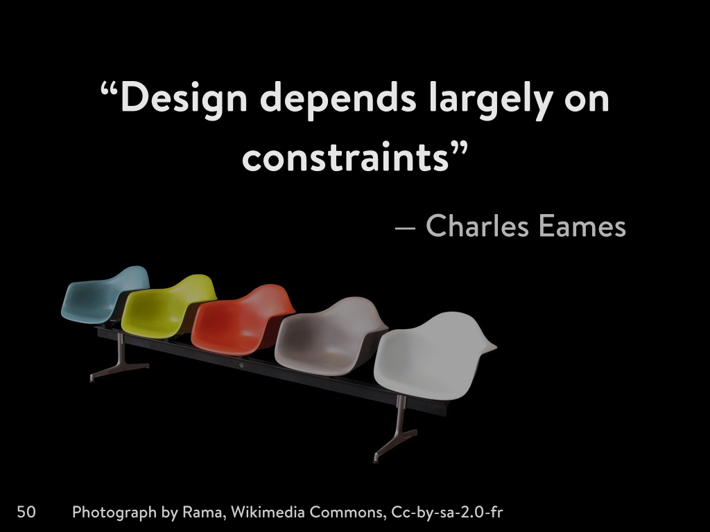
As a designer working in furniture, architecture, film, art, graphic and industrial design, Charles Eames understood that constraints affect design no matter the discipline. A designer’s work is to respond to requirements or aims set by others or ourselves.
On the web, constraints come in all different forms, some bigger than others. There are some overarching constraints that affect every project:
Project constraints
Each project comes with its own unique constraints dependent on its owners and their goals. A typical example of a project constraint might be existing brand guidelines. You have a particular logo, colour palette, tone of voice, and typographic system that has to be used on the project, and every other decision has to work around those constraints. You might have an existing content management system that dictates the framework and language you can use.
Medium/technology constraints
When we communicate in print, paper and ink is expensive. Newspapers look the way they do because we had to try to fit lots of text into tight columns on a few sheets of paper. When we communicate on the web, we avoid using massive images on every page because bandwidth is expensive. We compress our images, and try to optimise their appearance on different screen sizes.
Audience constraints
Audience constraints can also be seen as constraints through convention. They’re are certain ways we approach the web based on the activity and expectations of our audience. Why don’t more websites use horizontal scrolling? Because a lot of people don’t know how to scroll horizontally, so they might miss important content. Search boxes are usually in the top right of the page because people started doing it, and then so many people were doing it that we came to expect search boxes on the top right of the page.
Time constraints
Time is one of the most obvious constraints we have when working on a project. Even if we’re working on a constantly-evolving publishing project, there will be sub-projects within it. Such as articles and updates, that will be subject to a time frame.
Budget constraints
Budget and time combined forms the strongest constraints. As these constraints will constrain everything else within a project. Budget will put constraints on time, and time tends to push the limits of budget. This is why budget and time are often used as reasons to avoid accessibility. “We don’t have enough time to make our site accessible,” or “we don’t have enough money to make our site accessible” are two of the most common excuses.
Of course, these excuses aren’t good enough. I probably don’t need to explain the value of making a site accessible. There’s some truth in a little more budget and time being needed for accessibility; whether it’s through training, research, testing, or additional design and development time. But no more than is needed for the consideration of these other core constraints. Nobody would ever say that there wasn’t time or money enough to consider web performance as a constraint. The expense of not considering web performance is far too high. What we need to convey to people is that not considering accessibility is also expensive. It costs a huge amount in lost audience, and a lack of usability for the remaining audience.
I think accessibility belongs on this list as a core constraint that we consider as part of every project:
- Project constraints
- Medium/technology constraints
- Audience constraints
- Time constraints
- Budget constraints
- Accessibility constraints
Arguably, it could be a sub-set of audience constraints, but including it in that way could lead to the misunderstanding that people with accessibility needs are a sub-set of the overall audience, rather than looking at it from a universal design—everybody benefits from accessibility—approach.
Designers understand constraints
When we’re trying to convince designers to work with accessibility as a constraint, it shouldn’t be so difficult. Designers are used to working with much smaller and more specific constraints in the field of aesthetic design. When designers are learning their practice, they learn rules about typography, colour, layout, and form; and only once they understand these constraints, they learn how they can break out of them.
So let’s look at the four pillars of aesthetic design, and the constraints therein:
Aesthetic design and the accessibility constraints
Typography
When we look at web typography from an aesthetic point of view, we have two major areas to consider: the technical and the practical.
Technical typography
The technical part of web typography is considering how a font might look applied straight to text without any interference/fancy CSS typesetting, or any control over it whatsoever. Because this is what we work with on a basic level without JavaScript or the CSS that only works on a few platforms. We also need to consider how it renders cross-browser. Looking at fonts through progressive enhancement and cross-browser consistency is definitely an accessible approach to typography.
Text with a web font applied, but no other styling.
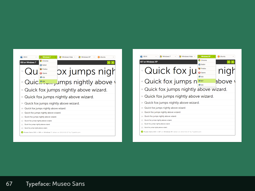
Checking cross-browser rendering using Typekit
Practical typography
It’s slightly less obvious when it comes to the practical part of web typography. In order to choose typefaces that work for our projects, we need to really understand what we want from a typeface, and what we aim to achieve through typography.
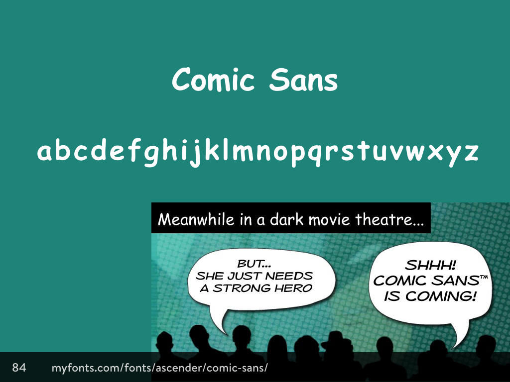
We need to remember that typography exists to represent content, and so it’s always worthwhile to read the text before we design it. Our aim is to invite the reader in, and make the text appear easy to read, not an intimidating mass. Typography should also reveal the meaning of the text. Comic Sans isn’t appropriate for a formal restaurant site, and a swirling script typeface isn’t appropriate for the website of a party clown.
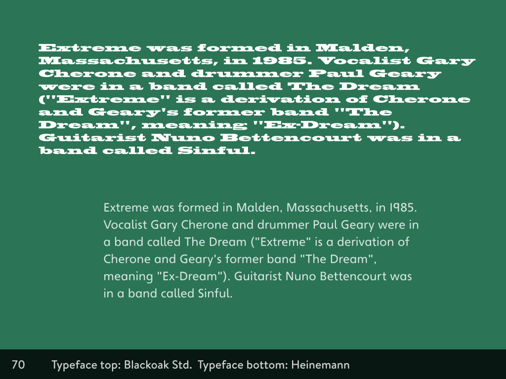
Blackoak Std makes for chunky intimidating body text, Heinemann makes for a more inviting paragraph.
When we read through the text, we can understand where it needs special treatment: where does the structure and order need to be made clear? The connections and differences between elements should be shown. The visual relationships between the text and other elements should reflect their real relationship. A heading is more important than a paragraph, and its importance should be revealed through size differences at the very least. All of these factors can be combined together to induce an ideal state for reading.
Clear headings, links, and typographic hierarchy.
The easiest win in accessible typography is just getting the text at a readable size. The most readable typeface is unreadable at a small size, yet so many sizes squeeze tiny text so they can fit more into a layout. Responsive design should have made it more obvious that scrolling is perfectly acceptable. The smaller the x-height (the height of a lowercase x), the bigger your text will need to be in order to be readable.
Readability
Whilst good structure and a strong differentiation between elements will help a reader understand how to read the text, the key to accessible typography is in choosing a readable font.
Uniform texture is more important than the shapes of the individual characters in a typeface. Typography isn’t the same as logo design. When we look at the relationship between the letters, an even texture helps our eyes flow over the text, not getting caught up on unexpected spaces and distracting shapes.
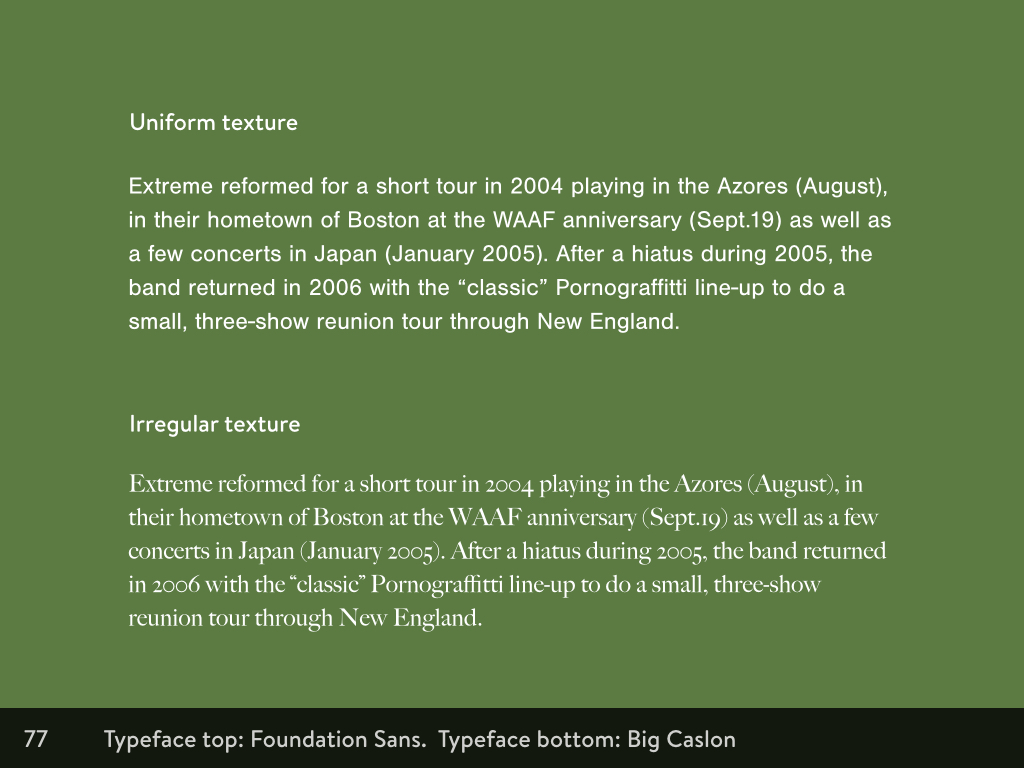
If you squint at the top paragraph, it has an even texture. If you squint at the lower paragraph, it’s a much more blobby, uneven texture.
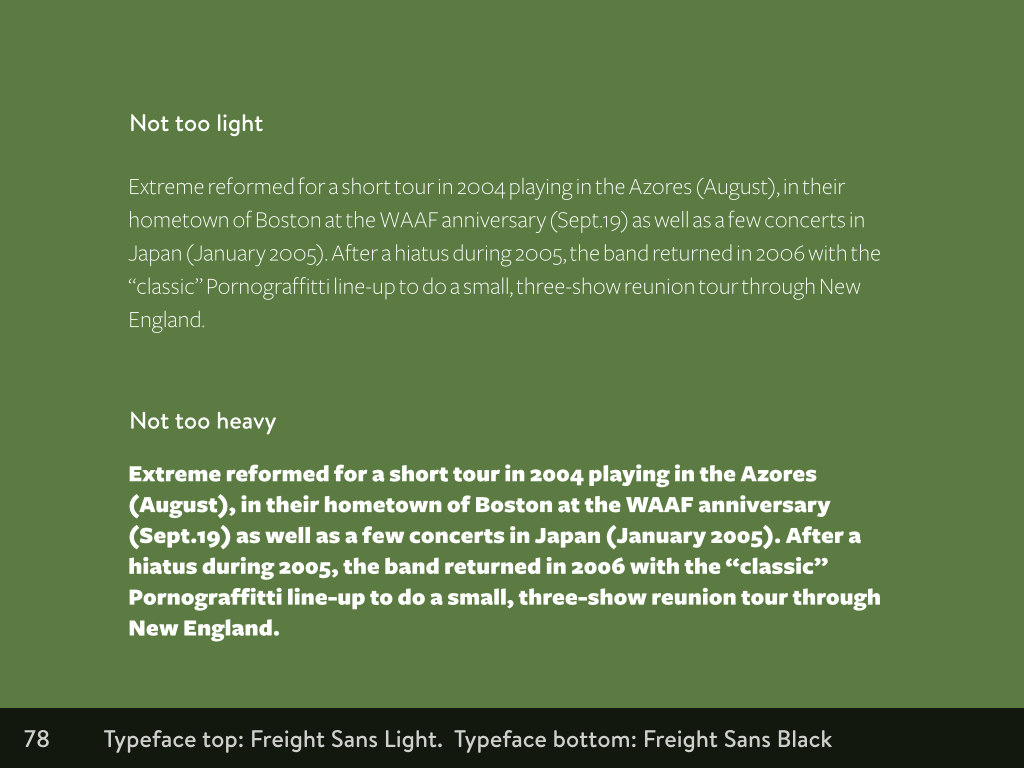
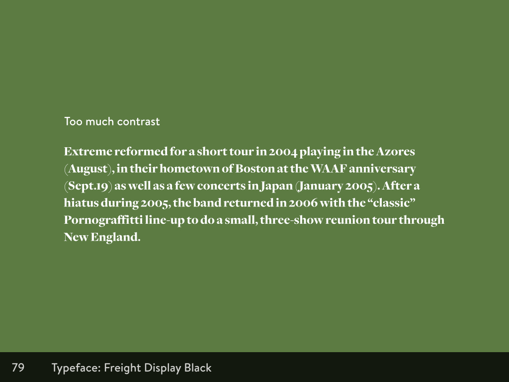
Since high resolution displays became the designers’ favourite, thin text is all the rage. Apple did it, and now everybody else does too. But so often thin text is just too thin, making the text appear very light against the background, making it harder to read. Heavy text also doesn’t provide enough contrast between the text and the background, as its chunkiness makes it hard to distinguish letterforms. You want to choose the Goldilocks of typeface weights: not too heavy, not too light. A high contrast of crisp letterforms with enough space around and between the shapes will make text much easier to read.
The lines of each letterform also need attention. Serif fonts, in particular, often contrast thick and thin lines within one letter. Your eyes are naturally drawn to the thick lines, and less to the thin, which creates an uneven and distracting texture, making it harder to read.
High-contrast serif
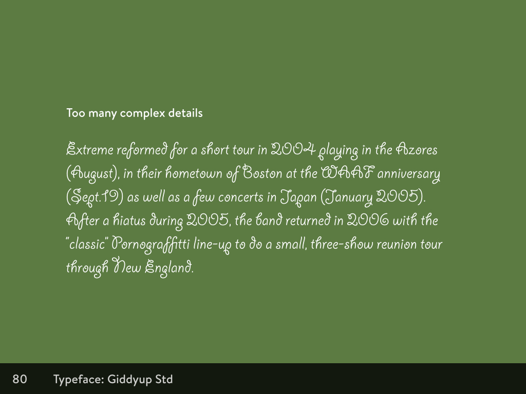
We also want to avoid complex details in the letterforms. The loops in Giddyup Std are cute, but overcrowd body text too much. You can see how our reading would be disrupted and tripped up by a loop or a curl in an unusual place.
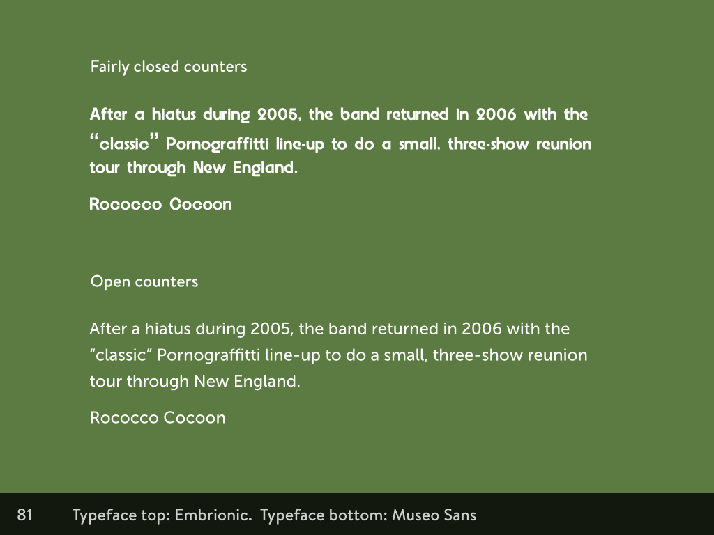
Another feature of letterforms that affects the readability of a typeface is the counters. These are the spaces inside the letters. Sometimes they’re open, like Cs, and sometimes they’re closed, like Os. We need a clear distinction between the open and closed counters, so you can easily tell them apart. Otherwise a phrase like Rococo Cocoon could easily be misread as Rooooo Ooooon.
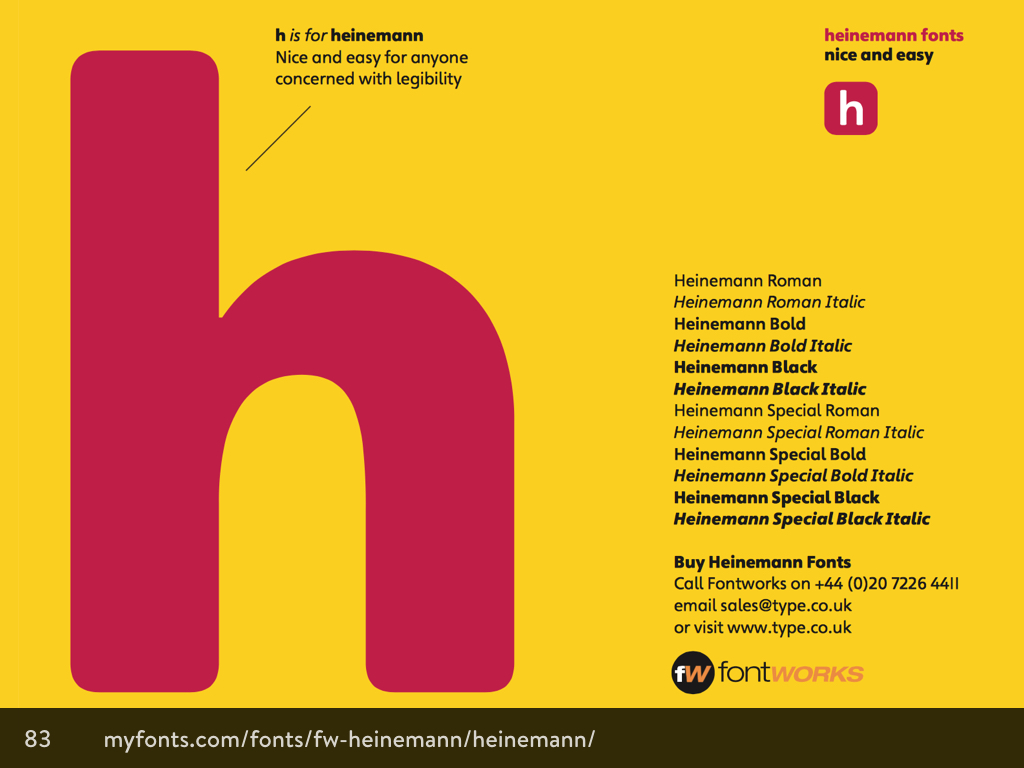
Some typefaces are specifically designed to be easier for people with cognitive difficulties. Heinemann is a beautiful typeface designed in-house at Heinemann educational publishing for young readers. The ascenders and descenders (the parts of the letters that ascend above the lowercase letters, and the parts that descend below the lowercase letters) are emphasised to make it easier for readers to distinguish between letters. The letterforms such as lowercase a and g are drawn in the same shape as we learn to write by hand, to make them more recognisable.
While many designers look down on Comic Sans, it shares those same early-learner letterforms as Heinemann, and is often favoured by teachers in classrooms as the letterforms are the same as those the children are using when they’re learning to write.
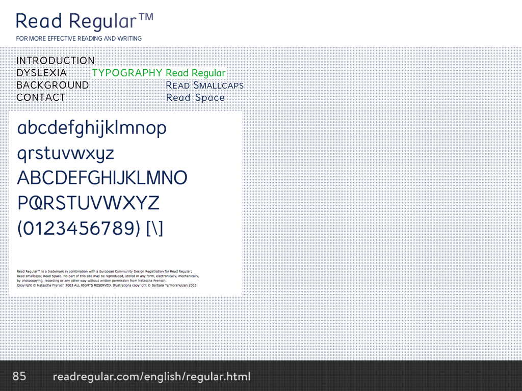
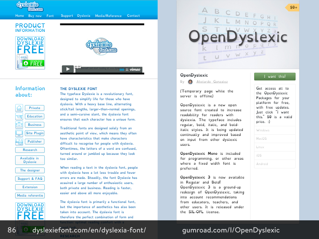
Read Regular, Dyslexie and Open Dyslexic are both fonts designed with dyslexic readers in mind, but with very different approaches. Read Regular is more similar to Heinemann in that it takes a sans serif style, and simple letterforms to assist in readability. However Dyslexie and Open Dyslexic take a very different approach, with noticeably heavier sections around the baseline to prevent readers from accidentally reading the letters upside down (a common issue in dyslexia.) The counters have been opened up, and similar looking letters (such as n and m, or vwy), have been adjusted in shape and height so they look different, and are easier to tell apart.
Colour
How we interact with colour
When we’re designing for the web, we tend interact with colour via colour pickers.
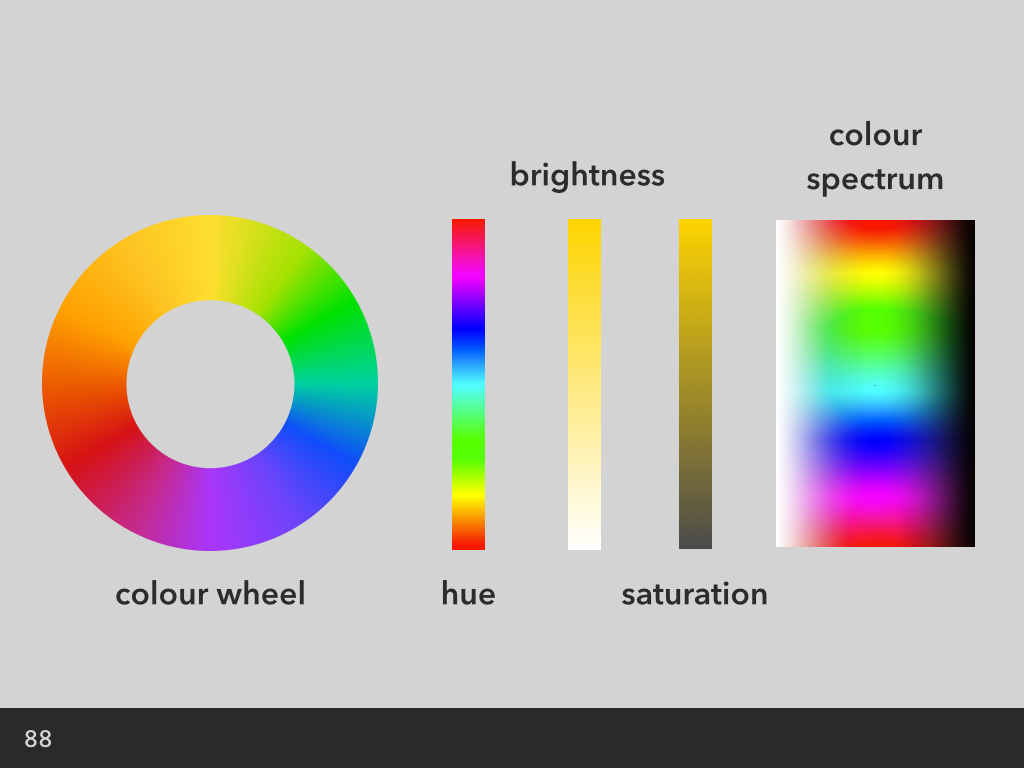
Colour wheel (left) is a more classic layout, with blended hues in a ring. The colour spectrum on the right is more recognisable as it takes the blends you see in the colour wheel, and adds white and black to give you varying shades. The bars in the middle are usually sliders, and allow you to slide between different hues, saturation and brightness for your chosen colour.
The benefit of using hues visualised on a colour wheel is that you’re more likely to find colours that work well in a palette. You can pick from side-by-side colours for an analogous blend, or from colours opposite each other on the wheel for a more striking colour contrast.
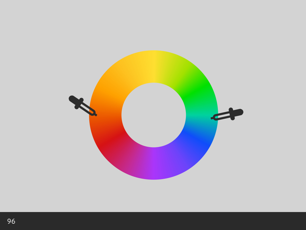
Colour picking from opposite sides of the colour wheel
But the accessibility of colour is more than just picking two different colours. In order to make our foreground text readable against our background colour, we need contrast.
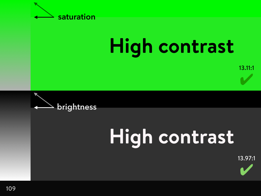
When we’re trying to find a good contrast, the colour wheel isn’t much help. The key is the sliders for brightness and saturation. A high contrast is caused by a greater difference the foreground and background brightness, and the foreground and background saturation.
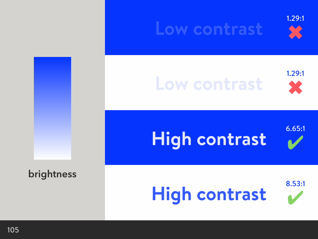
Varying the brightness for colour contrast
For example, a blue background with blue text of a similar lightness will be hard to read, whereas a lighter blue against a darker blue is much easier, making a more accessible foreground-background contrast.
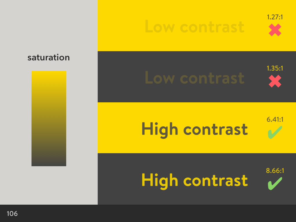
Varying the saturation for colour contrast
The same applies to saturation. Deeply saturated yellow text will have a low contrast against a similarly deeply saturated yellow. However, using a desaturated yellow in the background makes for a more accessible foreground-background contrast.
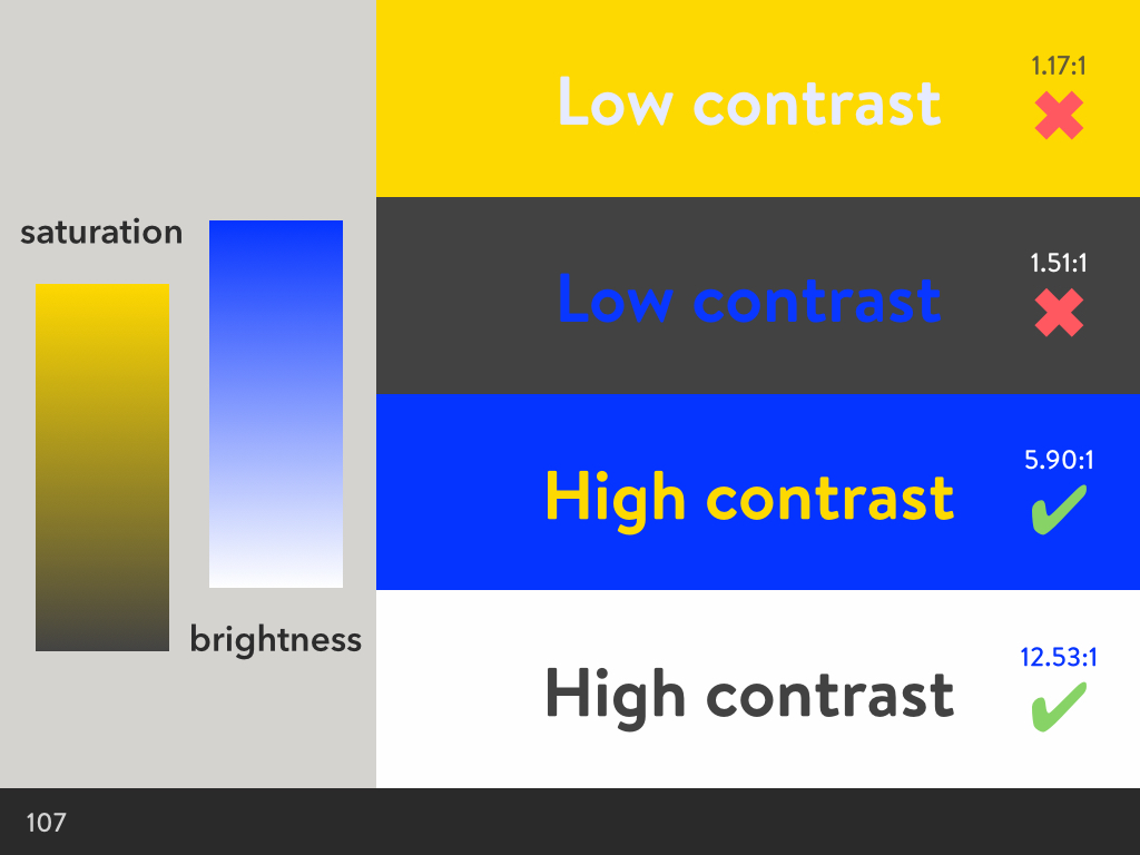
Using the different colour pairs with the same brightness and saturation as before
The same rules apply even when you’re using different colours for the foreground and background.
Very high contrast foreground and background combinations can also suffer from accessibility problems. Issues with high contrast aren’t talked about as often, but can hurt your eyes, and be particularly problematic for people with dyslexia.
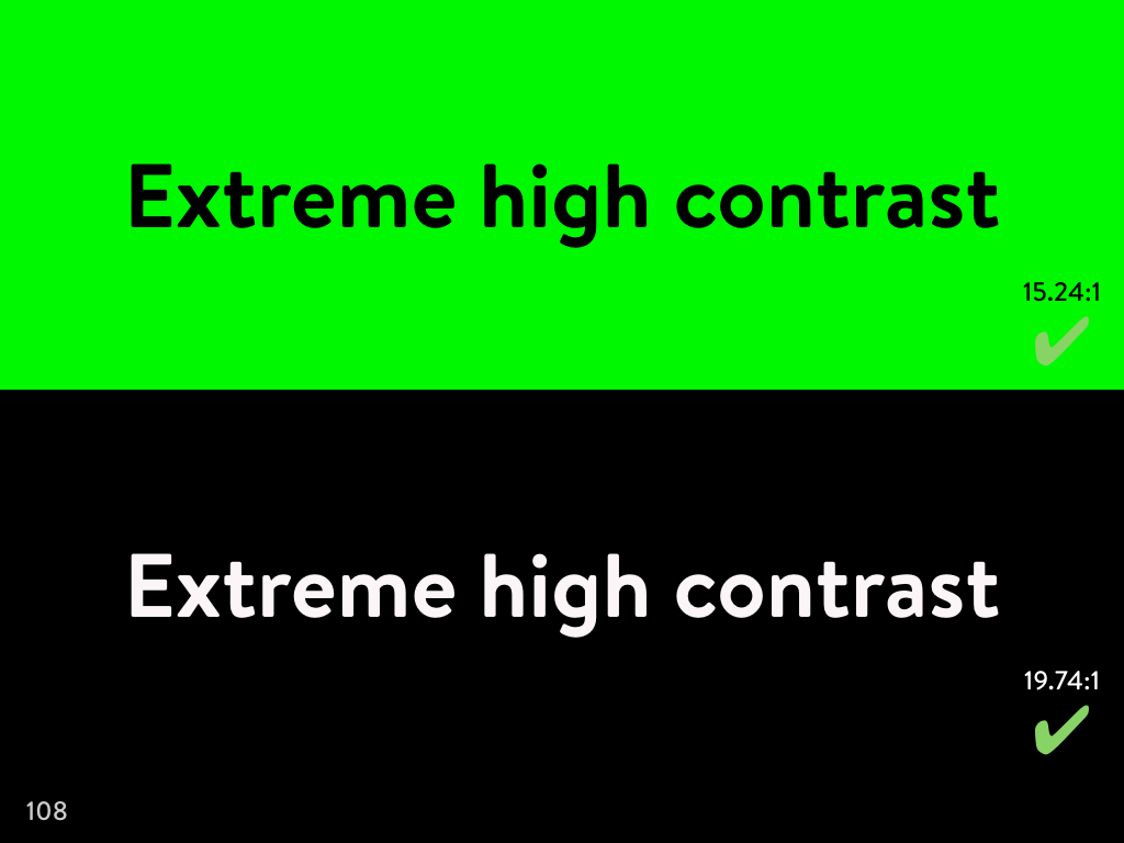
To avoid screaming high contrast, I would recommend softening the difference between the foreground and background values slightly, bringing one value slightly closer to the other. By tweaking these contrasts slightly, they’re much easier on the eyes.
Softening the high contrast values
Accessibility and Branding
If we considered accessibility at a brand level, what would that be like?
What if we designed our logos and associated colour palettes with an accessible colour contrast in mind? I’ve been doing this for years, not really thinking much of it. As a designer who usually created a logo and would then go on to design and develop a site around it, it just made sense to me.
Some of my old logo designs
If we make the colours accessible, then the colours we use on the site can be consistently on-brand later on; we won’t suddenly need to use a darker colour for our body text because our brand’s colour palette produces unreadable results.
Some early designs for logos, with accessible, web-compatible typography
What if we choose our logo and brand typefaces with readability and web typography in mind, not just which typeface has three letters that look good for our logo? Maybe if our logo is a swirling script face, we should consider a complementary body text early on, when we’re designing the rest of our brand. This could prevent us getting caught out when our site designer or developer has to pick a completely off-brand typeface because our brand typography is so hard to read as body text.
A beautiful script logo and beautiful web typography, but the brand doesn’t quite match up.
The earlier we, as designers, learn to consider accessibility, the less likely we’ll have our designs diluted and confused further down the line.
Strategies for involving accessibility from the beginning of the design process
So I have a few simple strategies for involving accessibility from the beginning of the design process…
Understanding accessibility
Just understanding why it’s worth making our sites accessible is a big first step. Only the most foolish people would learn a little about accessibility and not hold it in their heads for every future project. I don’t mean having to become an expert overnight, but just knowing little tips and tricks to make sites better.
Constraints
Considering accessibility as a constraint is a complementary to the other strategies. It’s a more specific way of thinking, as you’re always referring back to accessibility.
Sitting in on testing and focus groups
When we hear and witness the experiences of others, it’s much easier to:
a) understand how other people don’t interact with the web in the same way we do
b) understand the multitude of ways people CAN interact with the web and how we might better serve their needs
Being involved in human research
Being involved in human research is very similar to the previous point, but is more about being ahead of the work, rather than behind it. We need to be researching and understanding human interaction before we start a single task.
If we’re only discovering issues with accessibility in a later testing phase, we’re already behind the curve.
In the talk I gave this morning, I then went on to talk about the 3 Rs of Ethical Design. But rather than explain it to you here, I think you should watch Aral cover it in his talk Beyond The Camera Panopticon: You Are The Product (the part on Ethical Design starts at around the 53 minute mark.)Make accessibility more accessible
If we want to make accessibility more accessible to different roles in our organisations, we need to learn how to better incorporate it into our existing processes. Acknowledging accessibility as a constraint from the outset ensures we have it as a point of reference at every step in the process. This also deliberately avoids looking at accessibility as some kind of checklist. Designers need to understand that accessibility can no more be ticked off a list than user experience can. These aren’t checklist tasks, but are our goals, our focuses, and our approaches.
So that was my talk. Some of these thoughts are more developed than others. If you have any comments or want to discuss these things further, I’d love to hear what you think!
3 comments
-
Lisa LaMagna
Laura, this is the second time I have randomly found one of your articles, gained a lot of insight, and realized “oh, it’s Laura Kalbag again.” Thank you.