Notebooks and Getting Over Moleskine
I’m a notebook and sketchbook-aholic. Actually I’m addicted to stationery of any kind. Pens, pencils, post-it notes. It’s incredibly easy to convince myself I need these items when I mostly don’t.
Notebooks and sketchbooks (and maybe some nice accompanying pens), however, are an absolutely vital part of my working life.
Why bother with physical notebooks?
Evernote isn’t the same as writing by hand. Neither is any other note-making software. Balsamiq isn’t the same as wireframing by hand, or Photoshop for sketching. Neither is any other wireframing or design software. I don’t think I’m being books-have-to-be-paperback nostalgic here, but I can’t type rough notes or sketch rough drawings as quickly on the computer as I can by hand.
When email can’t be your record
I know a lot of us rely on email as a second memory. A lot of detail from various projects, discussions with clients, usernames and passwords are all findable by searching email. But what about those (horror horror) face-to-face meetings or phone calls? Notebooks are great for quickly jotting down the gist of things in an easy-to-interpret way.
You don’t have to worry about hierarchy as you would on note taking software (text mostly has to go from top to bottom, not laid out randomly across the page) and you can mix sketches and written notes without having to switch apps. (Fancy that! Old school!)

Random notes, post-its mixed in, who cares?!
It’s not about making it neat
One of the stigmas that I find are attached to Moleskines is the idea of the ‘perfect’ designer’s notebook. You envisage perfect neat pages of beautiful flowing joined handwriting or elaborate wall-worthy pen-and-ink drawings. I don’t know about everybody else, but my sketchbooks are filled with barely-legible scratchy notes and wireframes so wonky that you start to wonder whether browsers are available in parallelogram shapes.
(The “perfect” style Moleskine page, from Flickr)
It’s not about making it tidy, it’s about trying to get ideas out as quickly as possible without being held back by formatting. I can’t imagine most people show their sketchbooks to anybody else. For me it’s almost like a diary. You can see how many more rubbish ideas I come out with over good ones…

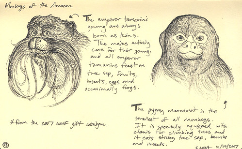
Probably rubbish ideas, straight lines not available…
What’s the perfect notebook?
There was a time when I was so anti-hipster that I wouldn’t buy a Moleskine. I think I’ve just about got over myself now, and a couple of years ago I indulged in my first overly expensive, but lovely, notebook. It was all about the squares. I couldn’t find another decent notebook with squared paper.
Why squares rock my world
Want to write along horizontal lines? You can do that with squares. Want to draw some quick wireframes that are slightly straight? Squares are perfect. The XLarge Moleskine squared notebook was my champion.
The new perfect notebook
Recently I decided I wanted to go for something different. I saw the Leuchtturm1917 (nope I’ve got no idea how to pronounce it, either) notebooks on The Paperie and I was wooed by the idea of a pretty coloured notebook.
So I bought myself a lime green large squared notebook. Along with a little pen holder, as I could get it in a matching colour. This notebook is lovely.

My Leuchtturm1917 Lime Notebook
The squares aren’t all the way up to the edges, like the Moleskine, it has margins at the top and bottom of each page and a space for the date. It has contents pages for you to fill in and comes with labels so you can index your notebooks. It isn’t quite as big as a XLarge Moleskine, but is a more manageable size than the larger Leuchtturm1917 notebooks and, being hardback, it makes it easier to handle.

Contents page in my Leuchtturm1917 notebook
Probably most importantly, the squares are more subtle. Moleskine squares are bold and black and you notice their presence. With the Leuchtturm1917, the squares are so subtle that once you’ve used a page, you barely notice them behind the contrast of ink pen. This would make it much better for pencil drawings as they’d definitely be harder to see on the Moleskine counterpart.

Subtle squares in my Leuchtturm1917 notebook
Noisy squares in the Moleskine squared notebook
What was this post?
This post was a love fest. I love my new notebook and I wanted to tell the world. Is it anti-linkbait to write a post that isn’t being hateful? I like that idea…

At the moment, my fave is the Mitsubishi Pencil Co’s uni-ball eye in fine black ink. I’m not keen on gel pens, as I find they’re too sticky. This one runs really well for writing and sketching as it’s very liquid.
However, for drawing, I prefer any old cheap black biro. They’re lighter and scratchier, like a pencil, so you can get a lot more different textures out of it than you can with an inky pen.
I find independent stationery shops or art shops tend to have the best range of pens. A lot of WHSmiths and other chain stores just do expensive fountain pens, biros, and girly-coloured gel pens with not much of any value in between!
I’ve always had an issue with the way that designers gush about Moleskine notebooks. There seems to be an elitist/consumerist agenda behind the love affair, as if owning a Molekine notebook somehow magically transforms one into a better designer and human being.
But I think you may have won me over with your description of the Leuchtturm1917, it certainly sounds like a sexy notebook with all the trimmings.
They’ve also recently got linen-covered Leuchtturm1917 notebooks in. So cool!
You should try Arwey notebooks. [http://www.arweystore.com](http://www.arweystore.com" rel=“nofollow)
My new perfect notebook! :)
They’ve become my perfect notebook, although I may have to try out a Leuchtturm one at some point now too…