Notes from Ampersand conference — My Digest
I’ve tried to condense my notes from Ampersand conference into a more useful digest. More than anything this, like my live-tweeting at past conferences, is really a selfish activity to help me absorb the ideas from Ampersand better by reflecting on the themes of the day.
And of course in the spirit of the web and all things good, I may as well share this digest so anyone who wasn’t there might get a taste of the event (albeit through my probably-twisted interpretation and slightly dodgy writing!)
Using typography
Typography is about context, context is about content
The web ‘industry’ is starting to focus more on content strategy, and that the whole reason our sites are there is generally to showcase content, and this was reflected in the importance of content being continually brought up throughout the day.
Vincent Connare was the first speaker of the conference. As the creator of Comic Sans, Vincent was the perfect person to explain the significance of fonts being created for a purpose, for a specific context.
Comic Sans was created for Microsoft Home software, when computers were starting to become used in the home. Its fun, casual, comic-book style was based on comics like Watchmen and Batman Returns and was successfully used in speech bubbles and children’s software. It’s the prolific abuse of Comic Sans in inappropriate signage, documents, and many other places that has made it so well-known and unpopular (or inappropriately popular!) As Jason Santa Maria said when talking about choosing an appropriate typeface:
No type is born evil, it’s the context that dictates if it works.
Jon Tan and Jonathan Hoefler both spoke about Bell Centennial, a font designed by Matthew Carter for phone books. The considerations in creating this font included environmental awareness, such as how the font is used and where it’s used. Matthew Carter made Bell Centennial easy to skim-read at 6pt and used ink traps for where the ink was likely to bleed on the texture of the phone book paper making the small text even harder to read.
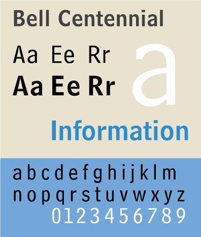
a sample of Bell Centennial
Content first
Tim Brown and Jason Santa Maria both spoke about how the context of the content gives them meaning when choosing a suitable font and how vital it is to compose your design with accountability. Some points they focused on for selecting a suitable typeface were:
- The content, its message, its reason for being
- The audience, who will read it? and how? for how long?
- The culture, the historical and cultural significance of the content, whether it will be read in other languages
- The context of the typeface itself, its resumé, what it signifies to others, how its production affects its appearance
Content-out
Mark Boulton got us designers thinking around content in a new way which is less concentrated on the limitations of our canvas (the size of the browser, the device) and discussed possible solutions for designing from the content-outwards. Mark suggested that as designers became fixated on web standards, we started to take the separation of content and style too literally which meant we created meaningless designs separated from our content. The content-out route really involves knowing the content first, which prompted a brilliant quote from Mark:
If you don’t know your content or audience, go to the pub.
Admitting he didn’t yet know any solid solutions, but wanted to encourage discourse, Mark suggested processes such as working on the details first then assembling a modular design from the details. This process is one that complements the responsive web design approach which almost every speaker hailed as a new way of working on the web.
Responsive design
Jon Tan explained how typography is one of the elements we can keep consistent across responsive design that reconfigures itself to suit different scenarios. No matter what the layout, screen size or device, the typography (along with colour) can instantly identify a design.
Tim Brown explained his process for building responsive design systems around type. The web, with its inherent flexibility, resists the rigid traditional print frameworks using ratios and fixed grids that previously gave designers a structure to work within. Tim suggests creating a modular scale, with the layout and every other element following the type, allowing it to work consistently regardless of device. This is based on the principle that we need a constant to work from in our designs, and type is a perfect constant to use. This is a way of thinking that designers can easily practise and exercise without affecting any of our current processes.
Tim went on to describe how using a modular scale, rather than arbitrary numbers, we can create a design system that is visibly cleaner and more harmonious. He suggested choosing sizes and spaces, such as type, borders, margins, padding, based on a pattern or scale. A couple of examples of ratios that Tim provided were:
- golden ration 1 : 1.618
- musical fifth 1 : 1.5
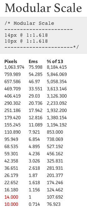
A golden ratio modular scale created using Tim’s website modularscale.com
Different ratios traditionally have meaning or significance to different types of people, so these contexts can even be used to choose an *appropriate *scale. This also gives designers a reason and justification to backup our design decisions.
Typography is more than text
Jason Santa Maria talked about how typography has a dual life. It’s about both the aesthetic and the readability. As designers we can often get caught up in how the text looks as a whole, but in reality users see the whole as texture and they skim across it. Users are more likely to stop and fixate on a small area for a moment, and this is where they will notice the typography and if it makes the text difficult to read. Jason emphasised the well-known idea that good typography is invisible, it’s about not making the user think or struggle to read.
Jason also made the point that readability isn’t always *can I read it? *but also *do I want to read it? *It’s in these scenarios that good typography can help create emotional experiences.
Typography can create emotional experiences
Jon Tan really expanded on his New Adventures in Web Design talk about the lizard brain by emphasising how typography can influence the subconscious. A typeface can convey emotion beyond the words in the text. Jon Tan quoted Paul Rand saying:
A logo derives meaning from the quality of the thing it symbolizes […] what it represents is more important than what it looks like.
This is controlled by a part of our brain called the amygdala which can evoke emotional responses without verbal or linguistic input. Jon explained how this means as designers, we need to understand how the brain works, how we need to understand how design makes us feel.
Vincent Connare made an interesting point when speaking about the design of Tahoma as a replacement for MS Sans. Tahoma was designed by Matthew Carter who is a real type designer and he created a technically superior font compared to MS Sans which was created by an engineer. Still, many users complained that they preferred MS Sans. As people get an emotional attachment and loyalty to that which they know, MS Sans was generally considered the ‘better’ font even though it was technically inferior.
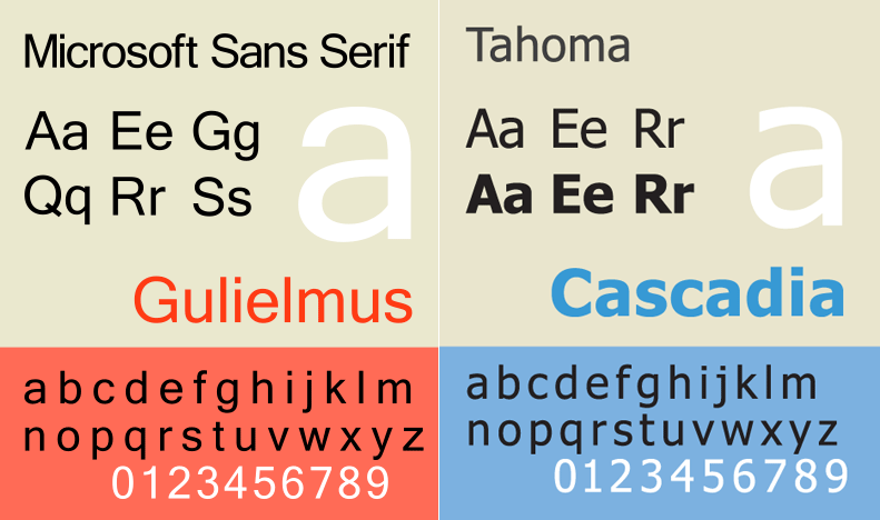
MS Sans (left) and Tahoma (right) samples
Typography is hard
As someone who often feels that typography can be overwhelming, and that it’s very difficult to know when you’re making the right decisions, it was great to hear Jason Santa Maria say that typography is hard. Jason went on to explain that a designer doesn’t need to know *absolutely everything *about typography to use it well, you just need to know how to estimate a font.
Guidelines for choosing and using type
Jason went into great depth on how to choose typefaces. He explained that there are no rules in typography, its imperfect precision where you can only be guided by basic principles and understanding the constraints. Some of the top tips that Jason gave were:
- Choose workhorse typefaces. We shouldn’t feel obliged to choose a new typeface for every project. Create a personal palette of typeface families that work well in display as well as body text. Use different styles from the same family to save having to find multiple typefaces that work well together.
- Avoid overly themed typefaces. These ready-mades show a lack of imagination. Subtle fonts can promote different emotions more effectively.
- Make a list of attributes and feelings that you want to convey, then find typefaces that convey that feeling. This also works for looking for typefaces that are similar, but not the same, to a standard that you use (perhaps such as Helvetica or Georgia.)
- **Test your fonts in context **and in the right space. Choose your font appropriately to the line height, line length and size required.
Web Fonts
The Benefits of Web Fonts
Everyone at Ampersand was evangelising web fonts. It’s impossible to not do so with all the exciting possibilities playing with lovely new fonts can bring.
Jon Tan described it as a time of renaissance considering we were previously forced to use such a minimal font palette, and we’re now being given a chance to prove our skills in design using these new tools. We can now choose type that’s *perfect *for purpose.
Jason Santa Maria echoed what I think everybody else was feeling in that it’s a good time to be a designer. Jason shot down the cynical idea that pople are misusing or abusing fonts and emphasised the benefits that we’re gaining in accessibility through no longer having to provide non-standard fonts through dodgy font replacement techniques.
Jon and Jason both spoke about how type can define a brand and how web fonts are helping unify the identity of brands across print and the web, helping convey a voice, facilitate an emotion, and create a relationship between the user and the design.
The Downside of Web Fonts
Along with the eagerness to try new web fonts, there was a lot of talk of the downside of web fonts, but with a positive outlook on how the awkward issues can be solved.
Looking back at font engineering
Metal typesetting, bitmap font creation and OS-safe fonts
David Berlow harked back to working in font engineering when fonts were first needed to look consistent from computer software to printer, explaining how this relates to the web fonts emerging today. One of David’s main considerations is how poor fonts can look at very small sizes. Bearing his experience with metal case type and bitmap fonts in mind, David focuses on how to make web fonts easier to read including basing them on specific size grids, using large x-heights with generally large amounts of whitespace and simplifying fiddly and complicated details.
Rendering
Rendering is a big issue, mentioned by most of the speakers. Jonathan Hoefler spoke about how the type designers at Hoefler and Frere-Jones are creating insane amounts of newly hinted glyphs in order to make their web fonts work as well as they possibly can across the web. Many web fonts are just bad translations of fonts created for print and consequently barely work on the web. A few speakers discussed the difficulties in the differences in fonts across Windows and OSX, with some users preferring Windows’ ‘crispness‘ and others preferring Apple’s ‘soft detail‘.
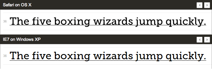
Museo Slab as seen in Safari on OSX and Internet Explorer on Windows (samples from Typekit)
Tim Brown emphasised how important it is to check your web font choices live, and repeating these checks across the different environments that will use those fonts.
John Daggett described the issues created by web browsers choosing their own fallbacks, such as creating awful synthesised bold fonts through smearing or drawing the letters twice, or obliqueing fonts to give them an italic appearance. Jonathan Hoefler expressed how the lack of being able to distinguish unusual font styles can be an issue, especially for those that have a back slant or are number-only fonts.
CSS Working Draft for Fonts
John Daggett’s talk was an intense look at the potential future of web fonts being controlled through CSS. It was at this point that I felt particularly hopeful. There’s something amazing about how quickly the web seems to have gone from a miserable collection of ‘web-safe’ fonts to being able to see how we can potentially use alternate glyphs and handle kerning.
I don’t think my notes cover all the fantastic features that John described, so for those I recommend you see the CSS Working Draft for Fonts, but here are some of the exciting tidbits I fancy:
- Using opentype font features through ‘font-variant:’. This means having loads of different font features such as multiple glyphs per character in an easy-to-use package giving us fine-grain control all through CSS. At the moment font-variant is used predominantly to select small-caps (with limited success.) The potential in font-variant means we could eventually select font features such as petite caps and automatic fractions, have more control over fallbacks, kerning, ligatures, language support and numerals, as well as supplementing other CSS properties such as text-transform.
- Security for web fonts. Rather than DRM, the idea is to restrict the origin of the font through http headers and the like, requiring a particular protocol, site or port. This could prevent other sites hot-linking your fonts or sniffing your font URLs.
A day listening to clever people talk about fonts
I think that me bothering to write a massive blog post about the themes of Ampersand conference really shows what an amazing day it was. I felt completely inspired, enthused and almost exhausted by the ideas and feelings being expressed by the speakers. I hope this rather disjointed digest might have helped bring some of this excitement to you lot who couldn’t be there on the day!
Recommended Reading and Plugins
Recommended Reading
- Responsive Web Design by Ethan Marcotte (via everybody)
- Codex magazine (via Jon Tan)
Recommended Sites
- Fontsmith (via Jon Tan)
- Google ‘font font focus’ for Font Font Focus sites (via Tim Brown)
- Hoefler & Frere-Jones at Typography.com (via Tim Brown)
- Paul Shaw Letter Design (via Tim Brown)
- Fonts in Use (via Tim Brown)
- Web Font Specimen (via Tim Brown)
- Modular Scale (via Tim Brown)
- Using Typekit font events for responsive and fallback design (via Tim Brown)
Recommended Plugins
- Lettering.js (via Jason Santa Maria)
- Fit Text (via Jason Santa Maria)
Nick Sherman’s history of [Bell Centennial](http://nicksherman.com/articles/bellCentennial.html" rel=“nofollow). [Wikipedia article on Peter Behrens](http://en.wikipedia.org/wiki/Peter_Behrens" rel=“nofollow), consultant artist for AEG, and designer of arguably the world’s first corporate typeface. There’s also a [gallery of Behren’s work](https://picasaweb.google.com/ID100Y/TheVirtualPeterBehrensExhibition" rel=“nofollow). All about the London Underground typefaces, [Johnston and New Jonhston](http://londonreconnections.blogspot.com/2009/09/typeface-for-underground.html" rel=“nofollow). Finally, a huge collection of [Blue Note covers](http://www.gokudo.co.jp/Record/BlueNote3/nnblue2.html" rel=“nofollow) that includes many by Reid Miles.
See you next year I hope!